Visual Identity for Soko | Branding
About the Project
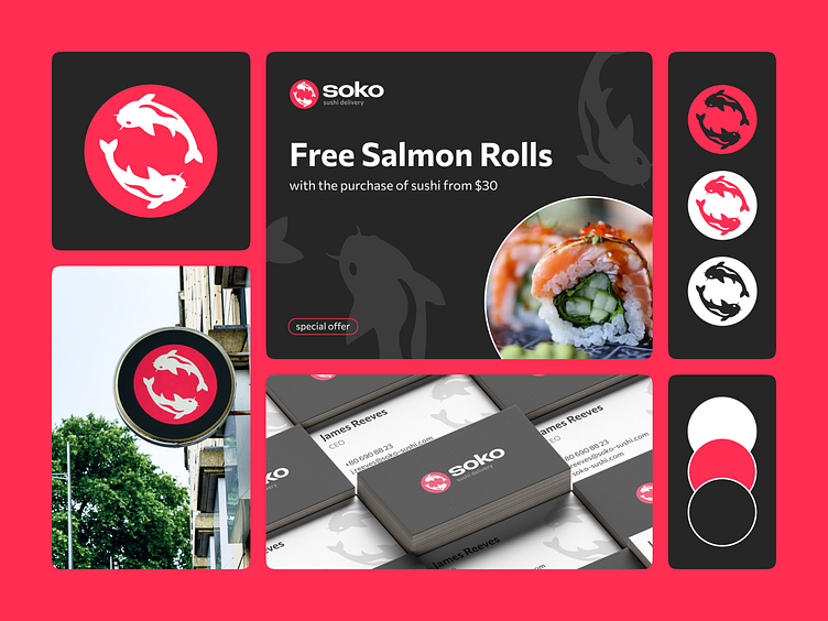
Soko is a food delivery company specializing in sushi and rolls. The main logo features koi fishes forming a continuous circle, symbolizing the company's consistency, flexibility, and high-quality standards. This circular motif influences the design of other graphic elements, forming the basis of the entire design system.
About Me
Hey! I'm Pavel 🙂
Not only a designer but also a marketer. This synergy of expertise helps my clients achieve their commercial goals: my approach includes brand development from various angles—visual, semantic, and verbal. All results are based on deep research of the audience and market.
Email: geyderikhp@gmail.com
Telegram: @geyderikh
