Fusion - Landing Page Redesign

Overview:
Circdata started in 2002 as a provider of event management tools. In 2021 company joined the ClearCourse business family and changed its name to Fusion. I would like to demonstrate a variant of redesign in 2024.

Objectives:
Update logo for better integration with marketing elements: badges, emails, registration forms etc. Current one looks good only when it's aligned left.
Rework the web-page to let clients get known with company in a clear and easy way. Currently, it looks like a cut-outs from a powerpoint presentation and its hard to understand the key points due to giant amount of similar text.
Define main purposes of the web-page, focus user’s attention on CTA buttons and advertise the main products.
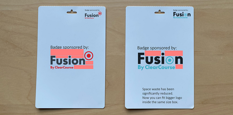
1. Logo update
First of all, I have extracted a new accent colour from the old background.
I chose a similar shade of navy, but in a lighter, vibrant variant. To my mind, it suits the IT field and represents the modern approach.

Next, I have slightly changed the current logo by replacing the letter "O" with a circle. This change allows to fit bigger logo inside the same shape box and makes company name more readable from the distance.
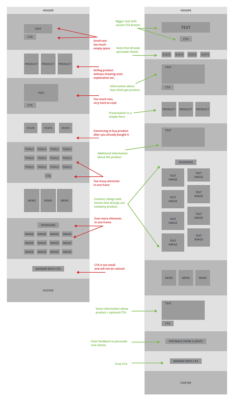
2. Wireframes:
I have done a lot of changes that focus on presenting the information in a easy and logical way. My goal was to gather clients attention on the first banner and guide them through the whole page without losing it.
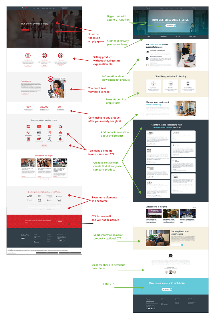
3. Major changes comparison
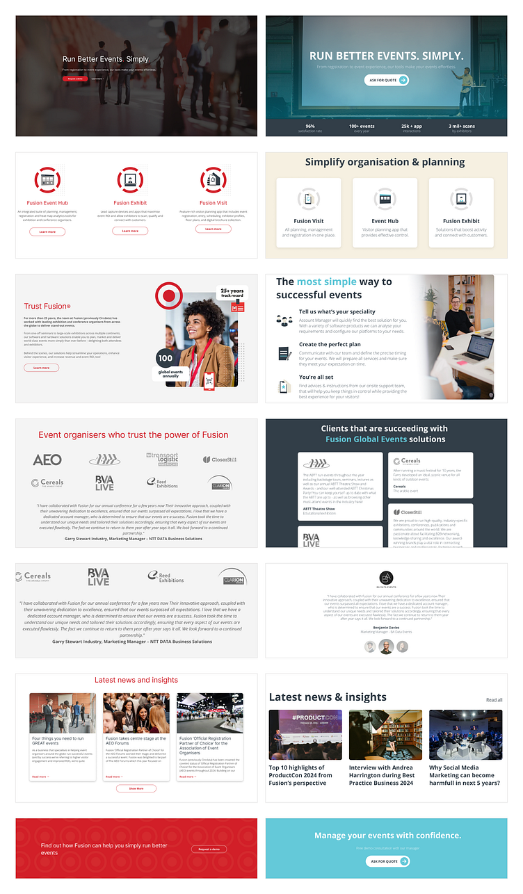
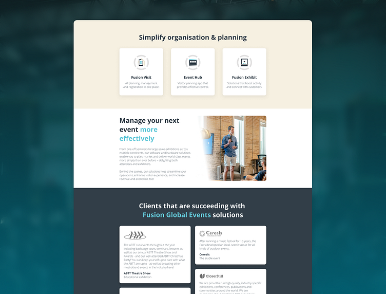
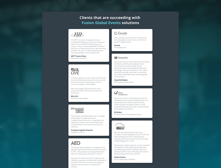
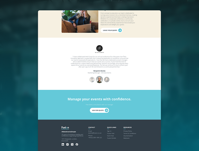
4. Final version of new landing page
(Click on image below for a proper scaling)

5. Result:
After re-designing the Fusion page I would like to say that this company has great identity and visual design, but lacks a lot of logical UX and should pay more attention to details. It was a pleasure to do this project and I hope that my design will be noticed by them and used in the future.
Thanks for your attention!
