Sydney Open: Promotional Media and Graphics
Sydney Open is an annual architectural event celebrating the city's famous monuments, taking guests on exclusive guided tours and talk shows hosted by renowned Australian architects.
I was inspired to not only create promotional content for Sydney Open, but also establish a design guide that can help me uniform all the forms of media I will be making. Thus, I created a simple brand identity consisting of a logo, colour palette, and typeface.
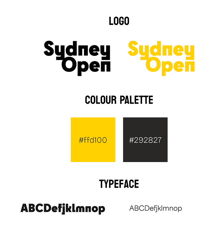
I find that a simple colour palette is easier to work with, especially when there are multiple media formats used for the event. A simple colour palette is easily transferrable, and audiences can attach quickly to signature colours. Yellow and black is a good combination that nullifies each other's negative traits; the yellow is muted down to give both a sense of brightness among the gloom, while the black plays well as a background that still makes yellow pop.
The typeface chosen for this project is Cy (for headers and main texts), and Area Inktrap (for body text). As I was going for a Brutalist-style for the promotional content, I find Cy to be the best fit. With the abstract and block-like shape of Cy, I chose Area Inktrap to balance it out.
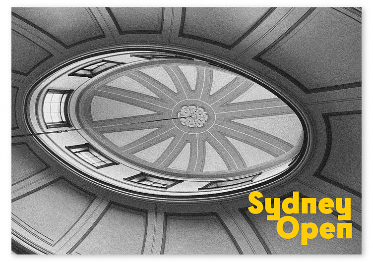
Posters
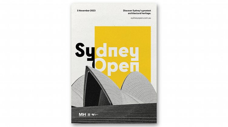
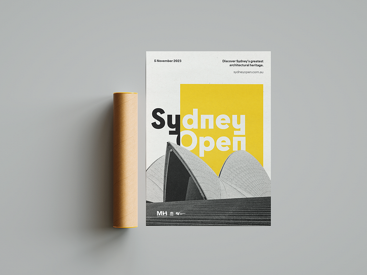
The main poster showcases Sydney's most famous architectural monument: the Opera House. The Bauhaus-esque style highlights the architecture aspect of the event.
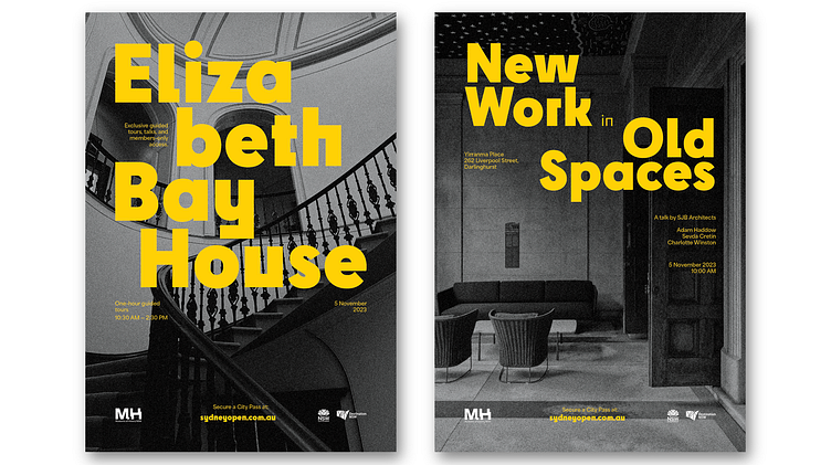
The previously mentioned Brutalist style of the brand can be seen on the event posters. The poster on the left is for a guided tour, with the location's name written in bright and bold yellow. The pposter on the right is for a talk show, with the title of the talk highlighted. The background for each poster corresponds to the location of where each event is held.
Brochure
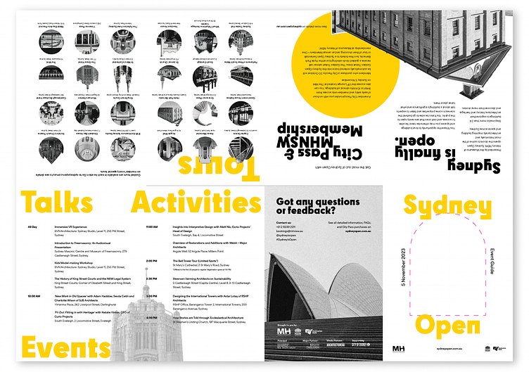
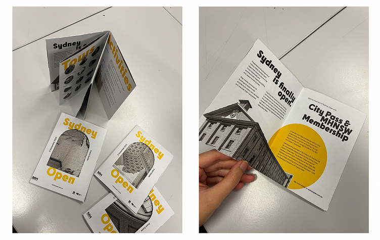
I've always loved zine-type brochures, but I wanted to give it a twist. On the cover of the zine, I cut a window-shaped hole to give the reader a peek into the back side of the brochure. This further emphasises the 'architecture' vibe, as well as giving a 3D touch to a seemingly boring zine cover. I also find zine-type brochures to be a bit wasteful, as the back side is seldom used. This hole, however, fixes that.
I am most proud of this brochure among all the other promotional materials, mainly because I edited the 'Tours' photos one by one. There were 38 locations in the original Sydney Open, but for the sake of this brochure, I only did 24, because not only did I not have enough space, I also felt myself going bonkers editing 24 individual photos into small, uniform avatars. But alas, it turned out just the way I wanted it to be, and I love how it looks like tied with the other elements of the brochure!
Web Banners

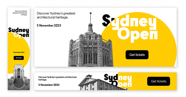
I had a lot of fun making this banner. It took 23 frames in total. I wanted to incorporate a button ('Get tickets') to prompt action from users, as people usually just skim past banners thinking they're not clickable.
Stickers
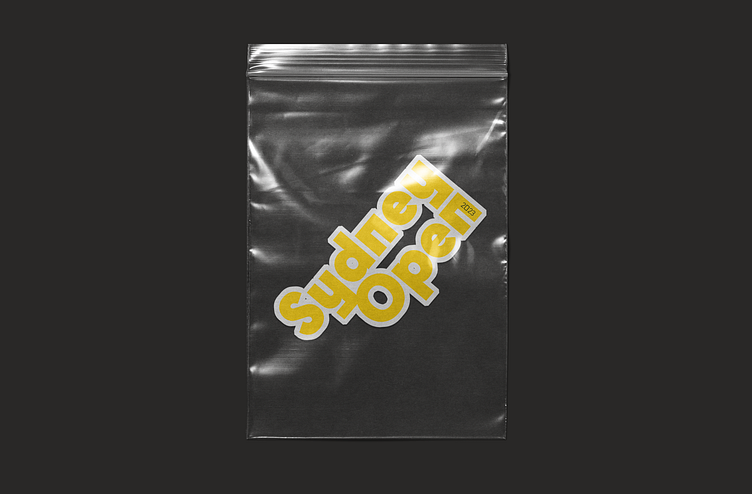
And who doesn't love stickers? I thought it'd be fun to add a small souvenir for visitors, so I used the Sydney Open logo and made it into a sticker.
DISCLAIMER: This project has no correlation with the Sydney Open event or the institutions that host it; it is a non-commercial personal project for a university course.
