Buttons: Cheat sheet – Nucleus UI
Let's dive deep into how a design system typically defines a button.
Note that this is not a design system document for Nucleus UI; rather, it's a cheat sheet that will assist you in creating a design system.
Check out Nucleus UI to help jumpstart any UI design project or design system.
Never recreate the same things; focus on what matters.
Button
A button allows people to initiate a specific action or process, such as submitting a form, opening a link, or starting a download. The action is usually clearly communicated through the button’s label (e.g., Save, Cancel, Download).
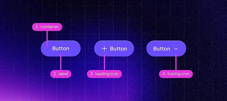
Anatomy
Container: A rectangle or rounded rectangle that holds the button text or icon.
Label: Descriptive text that communicates what will happen when clicking the button.
Leading icon: An icon, placed before the button label, providing visual context or reinforcing the button’s action. For example:
A magnifying glass icon before "Search" indicates its search functionality,
A plus icon before "Add New" suggests a creation action. These icons are valuable for quick visuals in a limited space.
Trailing icon An icon, placed after the button label, suggesting a subsequent step or action.
An arrow pointing right after "Next" indicates that clicking the button will take the user to the next step in a sequence.
A downward arrow following "Options" might imply that clicking the button will open a dropdown menu.
Hierarchy
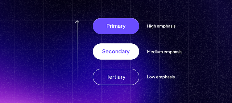
Button hierarchy emphasizes the relative importance of each button within the context, helping users quickly decide which action to take.
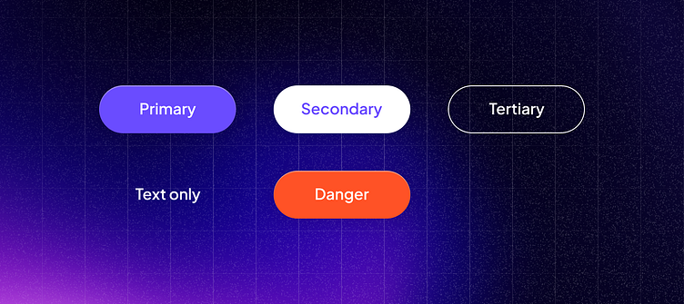
Primary Button: The most prominent button used for the main call-to-action. It's used for the most important actions.
Secondary Button: Less prominent than the primary button, used for important actions but not the primary focus. These often have a more subdued style.
Tertiary Button: The least prominent, used for the least critical actions or where space and context require a more subtle approach. Often styled as text or outlined.
Text-only Button: Mostly appears as plain text but is clickable, used when the action requires the least emphasis or to fit seamlessly with other textual content.
Danger Button: Used for actions that could have negative consequences (like deleting or disabling). This variant is typically styled with a warning color (e.g., red).
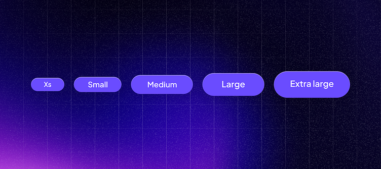
Sizes
Here are typical size variants found in design systems:
Extra Small (XS): Typically around 24 to 28 pixels. Suitable for very dense interfaces or alongside small form elements.
Small (S): Generally between 28 to 32 pixels. Used where a bit more prominence is needed than XS, but space is still limited.
Medium (M): Often set at 32 to 40 pixels. This is the standard size for most buttons and is commonly used for primary actions across various interfaces.
Large (L): Usually ranging from 40 to 48 pixels. These buttons provide greater visibility and are easier to interact with, especially on touch devices.
Extra Large (XL): This could be anywhere from 48 to 56 pixels or more. These are used sparingly for very prominent calls to action where maximum visibility and ease of interaction are paramount.
Tip: You won't need to use all the size variants in a single project. Most mobile apps might use 1-2 size variants, a marketing site could also use 1-2 sizes, while A SaaS platform could have more—2-4 sizes, depending on the context.
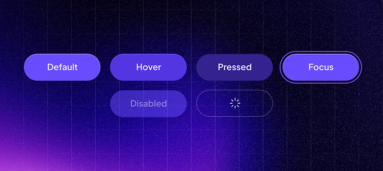
States
Buttons in a design system have different states to indicate their interactivity and purpose. Here are the various states a button can have:
Normal (Default): This is the base state of a button. It is interactable but not being interacted with.
Hover: This state is triggered when people point their cursor over the button. It usually changes the background color, border, or elevation to indicate it is interactive.
Active (Pressed): This state occurs when the button is being clicked or tapped–not yet released. It often features a more pronounced stylistic change such as a darker background color or an inset shadow to mimic a physical button being pressed.
Focused: When a button is in focus, typically from tab navigation or clicking without releasing, it is highlighted. This often involves an outline or change in shadow to emphasize that the button is ready to be activated by pressing enter or clicking.
Disabled: This state is used when a button cannot be interacted with due to certain conditions not being met. Visually, it is usually rendered with muted colors and a lack of shadow or interactive cues, indicating it is not active.
Loading: Some systems include a loading state for buttons that initiate processes requiring time, such as submitting a form. This state might show a spinner or progress bar to indicate that the action is in progress and that the button cannot be pressed again until complete.
Best practices
Use concise and action-oriented labels on buttons that convey the intended action or purpose.
Make sure the label color and background color have enough contrast to improve readability and accessibility.
Maintain a consistent visual style for buttons throughout the interface to create a cohesive and recognizable design.
Choose a button size that aligns with its importance and usage context. Important actions should have larger buttons to draw attention.
Limit the number of buttons on a screen to prevent visual clutter and focus on essential actions.
If you're on the hunt for a design system starter kit, check out Nucleus UI. It's the perfect toolkit to kick off your design projects.
Never recreate the same things; focus on what matters.