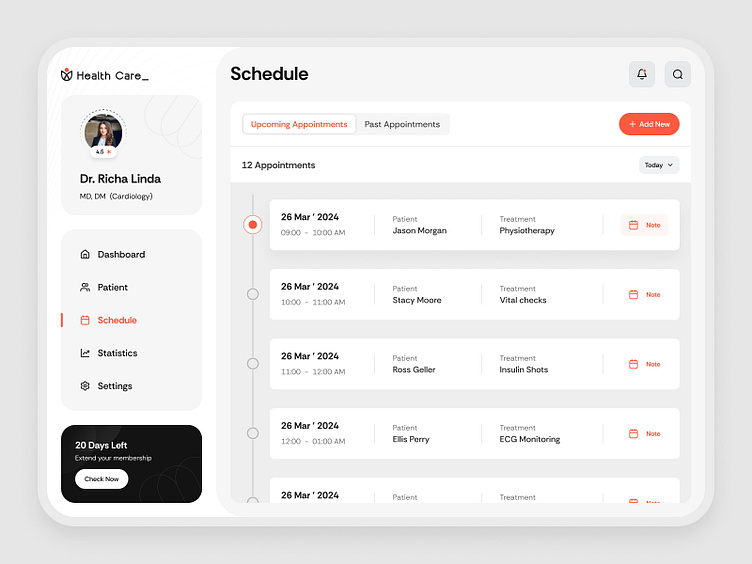
Doctor's Appointment Scheduler, HealthTech Platform, UI Design
Presenting the last shot of our HealthTech Platform.
We used grids on this screen to make it absolutely easy to navigate. It's uncluttered and intuitive.
What are your thoughts on this design?
Also, read our latest blog on-
Top 10 Mobile Navigation Design Examples and Complete Guide
10 Best Dashboard Designs to Watch in 2024
Creating an Exceptional Homepage Design Layout
Confirmation bias explained- Importance and examples
We are available for new projects!
We are experts in:
Feel free to reach out to us at: business@octet.design
For more - Look at us on Octet Design Studio
Follow us on: LinkedIn | Behance | Instagram | Twitter | Medium
More by Octet Design Studio View profile
Like
