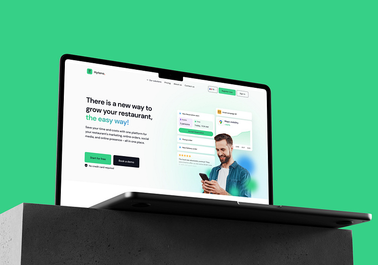
Hyteno - Landing Page & Dashboard
Saving Restaurants' Digital Costs by 70%
Hyteno is a digital solutions provider for restaurants. It provides them their websites, online reservations, social media marketing, SMS and Email marketing, and so on.
Industry: SaaS, Restaurant
Location: France, Nepal
Year: 2023
Area of work:
Product design
Design language
Requirements:
build a strong landing page,
and a dashboard for their online reservations system
Overview
The goal was to design a landing page and build a web product - dashboard to reflect newer enthusiasm of the company, and offer all of it value propositions.
Challenge - So much to include, so little space
We were offering features such as custom websites, review management, management of three order modes: reservation, delivery, pickups, handing promotions, handling menus...
To include these bunch of features at once for a first version, basically compressing a dense product into easy-to-navigate in the first stages takes extra skill.
Customers, interviews, vision - a homework done for three years
Customers for restaurant management apps are usually above 35 years of age. We had to magnify and simply all the UX flows. We already had insights, data and opinions regarding the product as the founder had been closely working with the industry professionals for about three years. So we took them, jotted them down, and started working.
Copywriting, UX Flow, and Basic Wireframes
The founder and I, researched the brand, and industry in order to get the copywriting part. Our primary job wasn’t copywriting, but still, we decided to collaborate in making this as well-prepared as we could.
The UX flow and copywriting went hand in hand. We worked on the flow, while simultaneously working on the copy. After a few sessions, we had some material.
We went on to search for high-quality landing pages and collected several ideas on how our website could look.
The UX flow was then translated into wireframes. These wireframes were approved by the founder, and the design work was begun.
Visual Design
We began by defining primary colors, and the design system. Our chosen typeface was DM Sans. The design previously used Poppins.
We were very careful with the details such as the shade of the color, typeface and it’s width. Whitespace was equally important to us, and we defined rules around each of these areas.
We spent several days working on it. Simultaneously, the founder and we were on calls refining and polishing the details. We decided to have animations, large cards, and plenty of whitespace and kept experimenting.
Eventually, we were ready with the final result. The final design was then made responsive for several screens including a responsive design for the mobile.
The founder and his team were happy, and excited about the work.
Designs
The Dashboard
The dashboard did not exist when I joined the company. I had to design it with the help of the team. Here are some of the designs we prepared.
Requirements
We were solving a variety of problems for the user. We wanted them to be able to:
accept orders
run promotions, loyalty
manage social media, and website
Above: Dashboard design
Below: Individual components for each variation of design in dashboard.
Onboarding flow design for the user and settings.
Design File organization. These things are usually secondary. Demonstrated here to convey that I prioritize that files be easily organized.
Designing Restaurant website templates
This section includes the website templates the product Hyteno offers to its customers. My responsibility was to do a research on types of restaurants in France, and make relevant templates. I was working closely with the founder, who provided a lot of quality insights and directions.
We asked: What do visitors want to see?
A person is looking for a restaurant to dine in: what do they want to see?
We did a series of competition research by scanning restaurants' websites and UX flows near Paris. We briefly categorized the restaurants into Indian/Pakistani, Japanese/Chinese, Italian, American, and others.
Directly sharing the final output here.
As of now
The company is serving it's customers with the dashboard that was prepared and the template websites. The user feedback have shared insights and the product has continued to evolve.
For work enquiries, bvlash@gmail.com


