UI Design Challenge - Day 13
For Day 13 of the UI Design Challenge, I focused on creating a user-friendly and visually clean interface for a smartwatch.
The Challenge
Design a set of cohesive screens for a smartwatch that prioritizes essential functions while maintaining a minimalist aesthetic.
The Solution
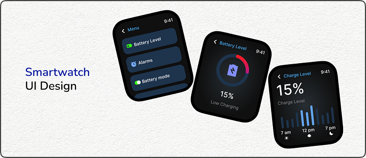
This design presents three key screens:
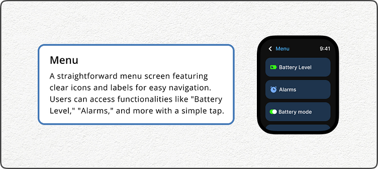
Menu: A straightforward menu screen featuring clear icons and labels for easy navigation. Users can access functionalities like "Battery Level," "Alarms," and more with a simple tap.
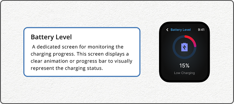
Battery Level: A dedicated screen for monitoring the charging progress. This screen displays a clear animation or progress bar to visually represent the charging status.
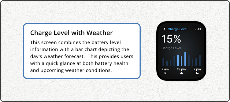
Charge Level with Weather: This screen combines the battery level information with a bar chart depicting the day's weather forecast. This provides users with a quick glance at both battery health and upcoming weather conditions.
Design Considerations
Limited Screen Space: The design prioritizes clarity and conciseness due to the smartwatch's smaller screen size.
Intuitive Navigation: Easy-to-understand icons and a logical layout ensure smooth interaction.
Minimalist Aesthetic: A clean and uncluttered design promotes readability and avoids overwhelming the user.
Overall, this smartwatch UI aims to deliver essential information efficiently while maintaining a sleek and user-friendly experience.
#ui #uichallenge #smartwatch #wearable #design #minimalism #userexperience #dribbble
Feel free to follow my work for more design explorations:
Looking forward to connecting!
