UX/UI Design for Fintech SaaS Platform | Masterly
Overview:
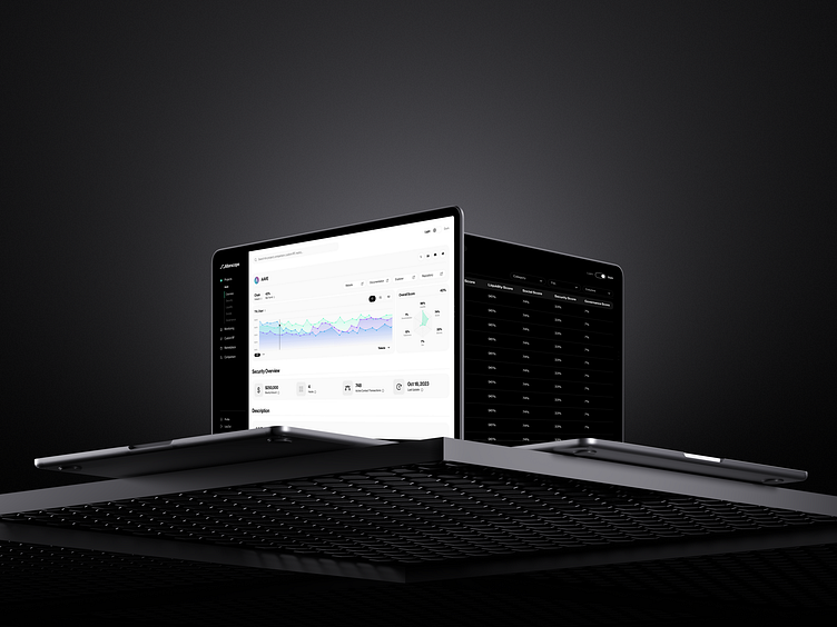
Alterscope offers a cutting-edge platform designed to process and model risk in real-time within the complex ecosystems of blockchain chains, protocols, and liquidity pools. Tailored for both protocols and investment firms, Alterscope delivers crucial insights into decentralized protocols, assesses their interdependencies, and establishes a solid groundwork for innovative risk-primitive solutions.
Live Link:
The Outcome:
Alterscope's initial platform faced challenges with user experience and interface design. We stepped in to reimagine and revitalize their offering, transforming the alpha version into a live, fully-optimized product.
Our redesign delivered an intuitive and engaging user interface that has not only won over users but also garnered unanimous approval from investors. The new Alterscope now stands as a beacon of design excellence and functionality, reshaping the way risk is managed in real-time across the decentralized finance landscape.
Design Process: Crafting Excellence:
UX Research, Ideation, and Planning:
Conducted a comprehensive UX audit of the Alpha version.
Analyzed user interviews, brainstormed solutions, and prioritized ideas.
Created rapid sketches and detailed wireframes to envision the product flow.
Prototyping:
Designed interactive screens with a cohesive design system.
Developed both light and dark modes for user preference.
Ensured responsive design for seamless use across devices.
Performed thorough QA for design consistency and functionality.
Validation and Maintenance:
Collecting and analyzing user feedback for continuous improvement.
Refining screens based on real-world use and testing.
Maintaining and updating the design system for lasting relevance and performance.
Challenges: Racing Against Time:
Faced with the formidable task of designing a robust product in a mere three weeks, our team was propelled not just by the ticking clock but by the prospect of unveiling our work to hundreds of investors at a pivotal event.
How We Rose to the Challenge:
We orchestrated a lean, conveyor-like process that has since become a staple in our workflow, characterized by efficiency and collaborative synergy.
Here’s how we allocated tasks among our dedicated team members:
UX/UI Design Lead: Took the helm in analyzing in-depth interviews, extracting and synthesizing key insights.
Primary UX/UI Designer: Worked in tandem with the design lead, fueling the ideation process, prioritizing concepts, and initiating sketches and wireframes.
Secondary UX/UI Designers: Focused on fleshing out the UI design and concurrently developing the design system, ensuring each element aligned with the overarching vision.
This streamlined process functioned with precision—once a task was completed by one member, it seamlessly transitioned to the next, allowing the initial member to dive into the subsequent phase without delay.


