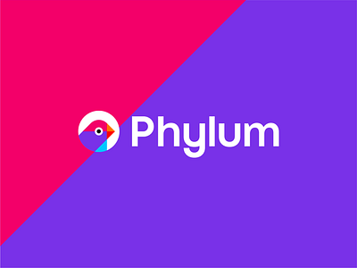
Geometric bird, logo design grid
In my logo design work, when I construct my concepts I apply and respect many basic geometric principles. In general, when I present my proposal these are not included because I consider that since in real life such grids will never be shown when implemented they have to resist and deliver on their own. However in order to share part of my process here is a sample of a grid system that I have used on creating this logo mark of a bird and also the full logo for a software development company.
As an extension to the logo I also implement the geometric principles used in the created logo in the identity design as you can see an example in here as well, where the reversed version of the logo comes on a colorful, dynamic background that extended the logo structure.
Check out the full case study: https://alextass.com/portfolio/phylum-saas-logo-identity-design-brand-guidelines/
--
Do you have a project? Let's work together!
Contact me at hello@alextass.com
Let's connect: alextass.com • Behance • Instagram • Facebook • Twitter


