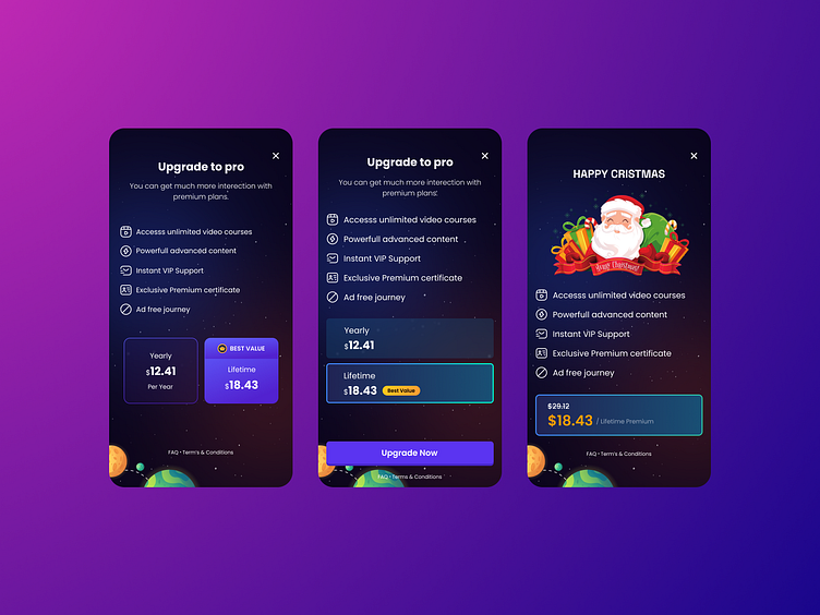
Upgrade to pro
Abstract:
This case study examines the design, implementation, and impact of the "Upgrade to Pro" purchasing page within a programming application. By focusing on user experience optimization, pricing strategy, and conversion rate optimization (CRO) techniques, this study aims to evaluate the effectiveness of the purchasing page in driving upgrades to the Pro version of the application and maximizing revenue generation.
Introduction:
The "Upgrade to Pro" purchasing page plays a pivotal role in the monetization strategy of the programming application. It serves as the gateway for users to access advanced features and exclusive benefits by upgrading to the Pro version. This case study explores the development process, design considerations, and outcomes of the purchasing page implementation, with a focus on its impact on user conversions and revenue growth.
Background:
The programming application had garnered a significant user base with its free version, offering essential coding tools and project management functionalities. However, to unlock advanced features such as code collaboration, version control integration, and advanced debugging tools, users were prompted to upgrade to the Pro version. The "Upgrade to Pro" purchasing page was designed to streamline the upgrade process, communicate the value proposition of the Pro version, and encourage users to make the purchasing decision.
Implementation:
The implementation of the "Upgrade to Pro" purchasing page involved a collaborative effort between the development team, UI/UX designers, and product managers. The page was strategically designed to highlight the benefits of upgrading to the Pro version, including advanced features, enhanced support, and exclusive perks. Pricing tiers and subscription plans were carefully crafted to cater to different user segments and maximize conversion opportunities. Additionally, the purchasing flow was optimized for simplicity and clarity, ensuring a seamless user experience from exploration to conversion.
Methodology:
To evaluate the effectiveness of the purchasing page, the following methodologies were employed:
1. Conversion Rate Analysis: Tracked conversion rates at various stages of the purchasing funnel, including page views, click-through rates, and successful upgrades, to measure the effectiveness of the purchasing page in driving conversions.
2. A/B Testing: Conducted A/B tests to compare different design elements, pricing strategies, and messaging variations to identify the most effective combinations for driving upgrades to the Pro version.
3. User Feedback Collection: Gathered feedback from users who interacted with the purchasing page to understand their perceptions, pain points, and suggestions for improvement.
Results:
The implementation of the "Upgrade to Pro" purchasing page yielded the following results:
1. Increased Conversion Rates: The optimized purchasing page led to a significant increase in conversion rates, with more users opting to upgrade to the Pro version after interacting with the page.
2. Higher Revenue Generation: The improved conversion rates resulted in higher revenue generation from Pro subscriptions, contributing to the application's overall monetization strategy.
3. Enhanced User Experience: Users reported a positive experience with the purchasing page, citing its simplicity, clarity, and effectiveness in communicating the value of the Pro version.
Conclusion:
The case study highlights the importance of a well-designed and optimized "Upgrade to Pro" purchasing page in driving user conversions and maximizing revenue generation in a programming application. By focusing on user experience, pricing strategy, and conversion rate optimization techniques, developers can create a compelling purchasing journey that effectively communicates the value proposition of the Pro version and encourages users to upgrade. Continuous monitoring, iteration, and testing are essential for maintaining the effectiveness of the purchasing page and sustaining growth in a competitive market landscape.
