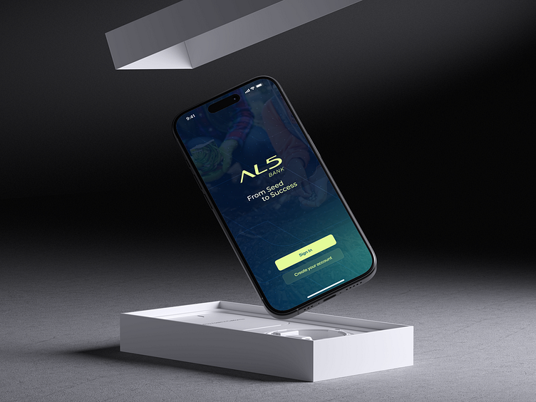
AL5 Bank app
Reducing Barriers to Account Creation: Revamping AL5 Bank’s Mobile App
Project Overview
The AL5 Bank Mobile App Redesign was a project focused on better serving the bank’s agro-industry clients. Recognizing the need for an app that truly supports the financial lives of farmers and agribusiness owners, we set out to enhance the app’s usability and intuitiveness.
Project Duration
2 months
Tools Used
Figma, Firebase Analytics
Team
Multifunctional Scrum team, with me as a designer, mobile and web developers, business analysts and manager.
Problem Statement
The original AL5 Bank app wasn’t hitting the mark for its users in the agricultural sector. It struggled to support the specific financial needs of farmers and agribusiness owners, which led to frustrations and inefficiencies. It became clear that a full redesign was necessary to better align the app with what these users truly needed.
Goal
Our main goal was to redesign the AL5 Bank mobile app into something that was not just user-friendly but also deeply intuitive—especially when it came to handling the financial activities that are crucial in the agricultural sector.
Research Methods
Desk Research:
I dug into Firebase analytics, app store reviews, and customer support data to get a clear picture of how users were interacting with the app and where they were hitting roadblocks.
Usability Analysis:
This analysis highlighted major pain points in the user journey, such as confusing navigation and complex interfaces that made the app difficult to use.
Competitor Analysis:
By looking at competitor apps, we were able to identify successful features and industry standards that informed our redesign, ensuring we stayed competitive.
Key Findings
The research phase brought several important issues to light:
Onboarding Process Flaws: We found a critical issue in the onboarding process that was preventing users from completing sign-up, which had a direct impact on user growth.
Form Field Confusion: Feedback showed that users were confused by some of the sign-up form fields, which also felt redundant to them.
Technical Issues and Missing Information: Users reported frequent glitches and expressed frustration over the lack of crucial transaction details.
Ideation
Given the clear issues I identified, I focused on targeted heuristic adjustments rather than broad brainstorming sessions. Our goal was to directly address the specific problems uncovered during research.
Prototyping
Using Figma, we created high-fidelity prototypes, making use of an existing design library. This allowed us to focus on visualizing solutions quickly and effectively, without reinventing the wheel.
User Testing
I have conducted moderated testing with 10 participants. The feedback was clear: financial jargon and complex terms were tripping up users, especially during the sign-up process. This was a major barrier to user comprehension.
Iteration
We took the testing feedback seriously and made significant changes:
We simplified the language throughout the app, removing unnecessary jargon.
We cut down on redundant form fields.
We added explanatory screens to help users understand complex actions.
Client Reception
Initially, AL5 Bank wasn’t fully convinced that a UX designer was necessary. However, after seeing the positive impact of the redesign, they became firm believers in the value of a user-centered approach. As a result, they decided to permanently include a UX designer in their development team.
User Experience Improvements
The results spoke for themselves. After the redesign, the number of Customer Support tickets related to the onboarding process dropped significantly. This not only indicated a better user experience but also improved operational efficiency for AL5 Bank.


