Logo, Logo design, Branding, Architecture Brand identity
Kalex Architects & Planners
Overview:
Kalex Architects & Planners, a leading firm specializing in innovative architectural solutions and urban planning, approached us to redefine their brand identity. With a rich history of excellence in design and a commitment to creating sustainable, functional spaces, they sought a visual identity that would reflect their expertise and vision.
Discovery & Research:
Our journey began with in-depth discussions and extensive research into Kalex's ethos, values, and aspirations. We delved into their portfolio, exploring past projects and understanding their unique approach to architecture and planning, which centers around sustainability and functionality. This groundwork provided crucial insights that guided our creative direction.
Conceptualization & Design:
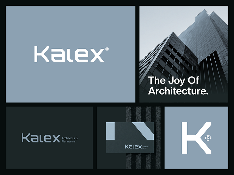
Drawing inspiration from Kalex's commitment to sustainability and functionality, as well as their emphasis on elegance, innovation, and versatility, we embarked on the design process. We crafted a symbol incorporating the letter "K," creating a visually striking yet memorable icon that embodies strength and sophistication. Alongside this symbol, we developed a wordmark with bold, clean shapes, ensuring it would leave a lasting impression in the minds of Kalex's audience. As we all know, wordmarks are powerful tools in branding, capable of embedding themselves deeply in the human mind. The neutral color palette we selected adds a touch of timelessness and uniqueness to the brand identity, setting Kalex apart in their industry.
Refinement & Iteration:
Collaboration was at the heart of our process as we fine-tuned every aspect of the brand identity. Feedback from the Kalex team enabled us to refine our concepts, ensuring alignment with their vision and values. Each iteration brought us closer to a solution that not only captured the essence of Kalex's identity but also communicated their dedication to sustainability and functionality effectively.
Problem Solving:
One of the primary challenges we addressed was the need for Kalex to differentiate themselves in a crowded market while staying true to their core values of sustainability and functionality. By developing a distinct visual identity that seamlessly merged sophistication with innovation, we provided Kalex with a powerful tool to stand out and attract clients who prioritize sustainable, functional design.
Consistent marketing materials:
With the design finalized, we seamlessly integrated the new identity across various touchpoints. We designed marketing materials such as business cards, letterheads, envelopes, and files/binders, ensuring consistency and professionalism in every interaction. Additionally, we crafted social media materials including posts and cover images, extending Kalex's brand presence across digital platforms.
Impact & Results:
The unveiling of Kalex Architects & Planners' refreshed identity garnered widespread acclaim, resonating with both existing clients and new prospects. The revitalized brand image not only elevated their visibility but also strengthened their position as leaders in sustainable architecture and urban planning. The compelling narrative behind the design process served as a powerful testament to Kalex's dedication to excellence, innovation, and sustainability.
Conclusion:
In crafting a distinctive identity for Kalex Architects & Planners, we embarked on a collaborative journey rooted in research, creativity, and strategic thinking. The result is more than just a logo – it's a visual embodiment of Kalex's legacy and a reflection of their commitment to creating sustainable, functional spaces for generations to come.
Client: Kalex Architects & Planners | Service: Logo & Visual Identity
For inquiries:
Mail: jubayergd60@gmail.com, Whatsapp: +8801797623803
Full project: Behance
Follow me for stunning visuals and insights on:


