Web Design & Case Study
Hi, I'd like to share a brief overview of a project I'm particularly proud of. Toggletap is a web development agency specializing in providing design and development services to businesses seeking robust web designs delivered efficiently.
Hero Section
To differentiate from a generic layout, I drew inspiration from another web design agency's layout that captivated me. I decided to incorporate it into a significant project to enhance my portfolio substantially. What makes this layout remarkable is its laser focus on conveying the core message of each section, particularly the hero text. By omitting extraneous artwork on the first page, this approach delivers clarity and efficiency in communicating your business's purpose. The absence of media elements on the homepage encourages users to engage more deeply; as in studies it have been observed that those who begin reading text without distraction often continue and finish, building curiosity and prolonging their time on the site.
The section following the hero section adds a touch of fun after presenting a lot of text. To encourage users to stay longer, a good approach is to incorporate humor. This section aims to connect users with the website's content and create a comfortable atmosphere for better communication, particularly if they are interested in working with us.
In this section, we offer a daily quote or general knowledge to smoothly transition from a different topic to discussing real business. Not every section is focused in selling; some are included to shift the tone seamlessly....
The sections above list the design and development services offered by the agency. The goal was to categorize all services under relevant sections to provide a comprehensive overview of available services. Organizing them collectively enhances visibility and understanding of the services. Additionally, animations corresponding to each service have been placed on the right side for visual representation.
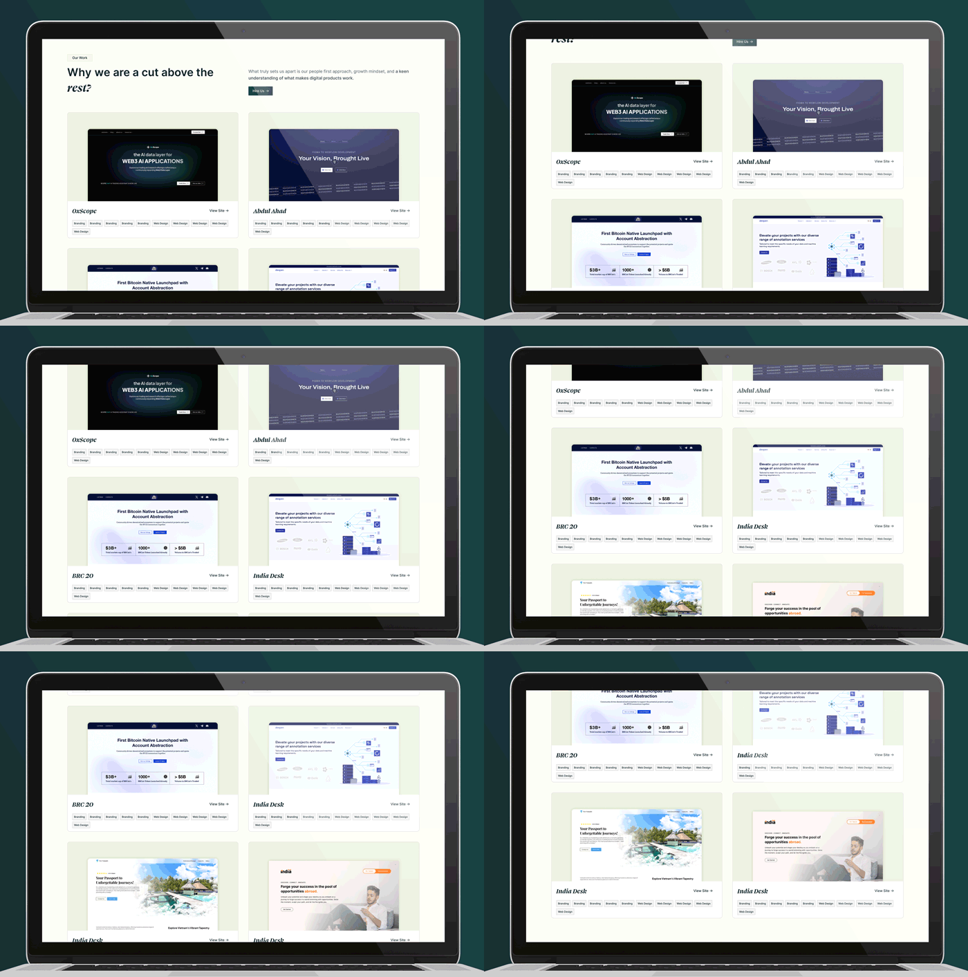
The "Our Work" section above features high-quality projects displayed as shown above. Typically, I've designed this section so that when a user hovers over these cards, the project design starts automatically scrolling, providing a top-to-bottom view of the project. This feature allows users to explore the project details without needing to navigate to another page.
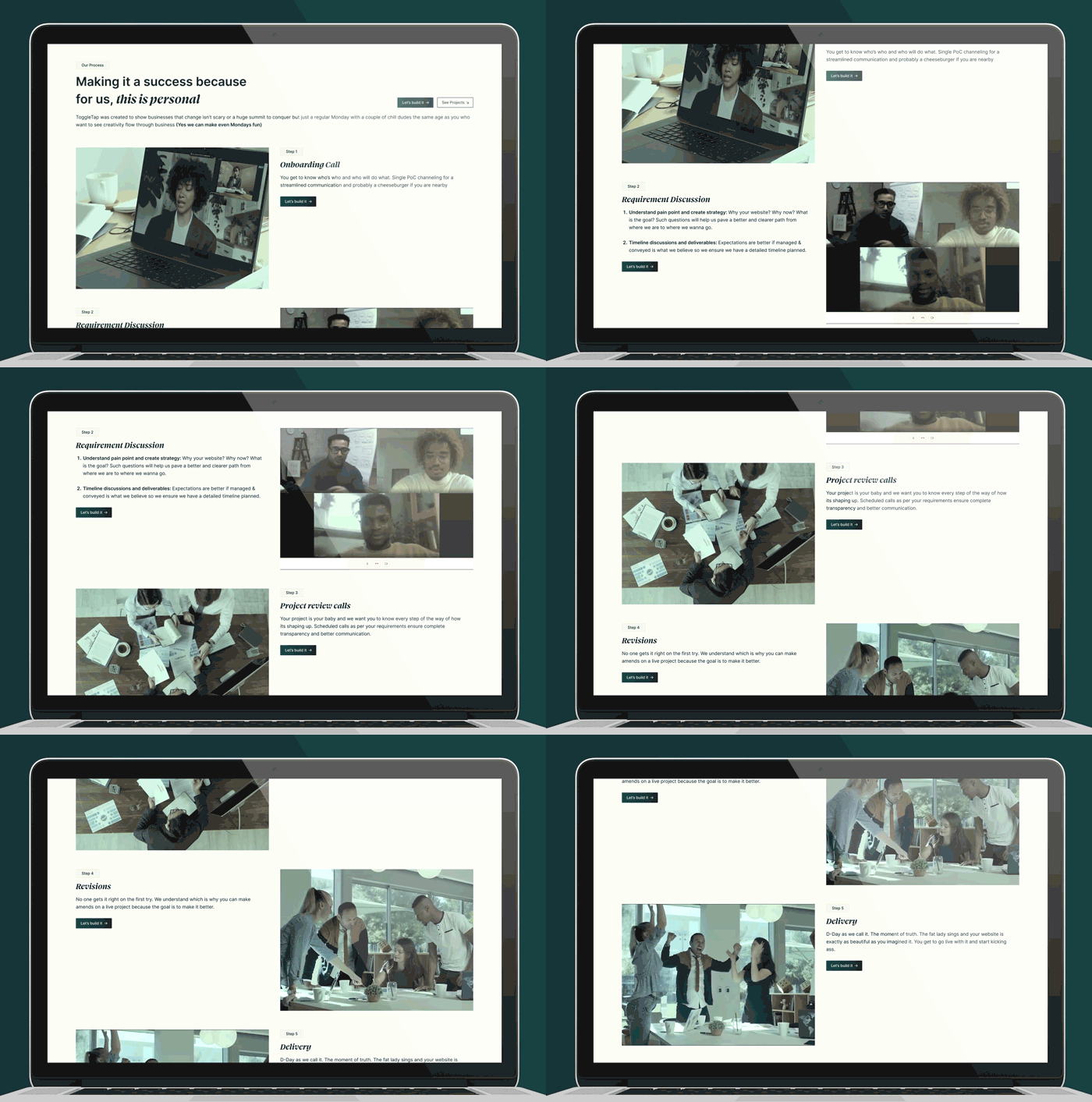
The "Our Process" section follows a left-to-right layout, showcasing each step in the process. This layout provides a professional glimpse of how we handle clients—from gathering requirements to delivering the project. This approach not only appeals to clients but also instills a sense of trust in our organized approach to task execution.


