UI Challenge - Day 12 (Smart Home App UI)
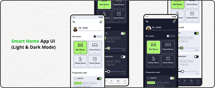
Welcome to Day 12 of my UI challenge! Today's focus is a mobile app for a smart home, designed with both light and dark themes for user preference.
Key Features
Personalized greeting: Users are welcomed back by name ("Hi, Aditi!") alongside their profile picture for a warm touch.
Clear room organization: Rooms are showcased with intuitive icons and device counts (e.g., Bedroom (3)). Pill-shaped CTAs allow easy access to individual room settings.
Actionable "My Rooms" section: This section empowers users to control specific rooms with a tap.
"Frequently Used" section: Quick access cards featuring commonly adjusted features like lights and thermostats.
Lights card: Offers on/off toggle, room selection chips, and a slider for adjusting brightness (Dim - Bright).
Thermostat card: Similar to lights, but includes a slider for temperature control (Low - High).
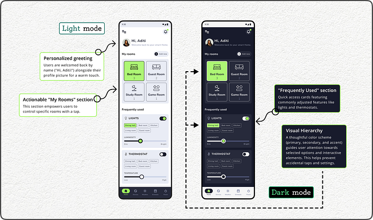
Visual Hierarchy: A thoughtful color scheme (primary, secondary, and accent) guides user attention towards selected options and interactive elements. This helps prevent accidental taps and settings.
Feedback Welcome!
Let me know what you think of this design approach for a user-friendly and visually appealing smart home app. Would you prefer light or dark mode for your smart home?
#UI #UX #MobileApp #SmartHome #LightMode #DarkMode #HomeAutomation #DailyUI
Feel free to follow my work for more design explorations:
Looking forward to connecting!
