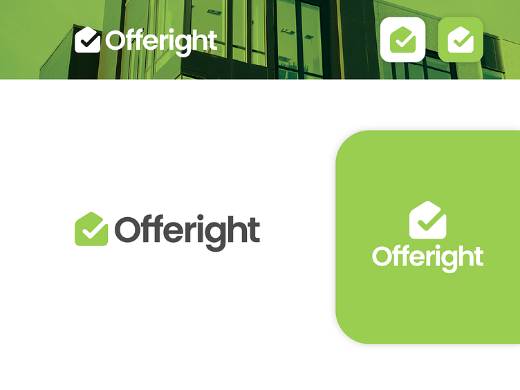
Offeright Logo Branding - 2024
Offeright logo is a combined shape of a house and a tick mark, which represents trust, right thing and in this case, it also represents right deal, right offer, safe housing. The color blue has also been chosen because it represents trust, security, confidence. Meanwhile, the font (Poppins) itself is a modern professional font which was a pretty solid fit with the overall logo and it's persona. Hope you liked the work, and we look forward to hearing back.
Follow Creatifi Studios - Facebook, Instagram, Behance
Contact us to get your brand designed - 📩 contact@creatifistudios.com
Visit our website - Creatifi Studios
More by Creatifi Studios ✪ View profile
Like
