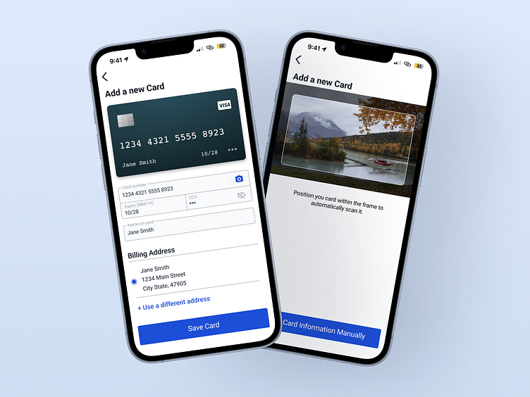
#002 Credit Card Checkout
This challenge was pretty vague. A credit card based checkout is way more than one screen! I decided to limit myself to just two for the sake of keeping this a small UI piece vs an entire UX flow. Since the challenge specifically called out credit cards I decided to show two major screen states for entering card info. One where everything is filled out, and another where there isn't as much in terms of UI elements, but has my preferred experience. Please just let me scan my card!
More by Anna Galante View profile
Like
