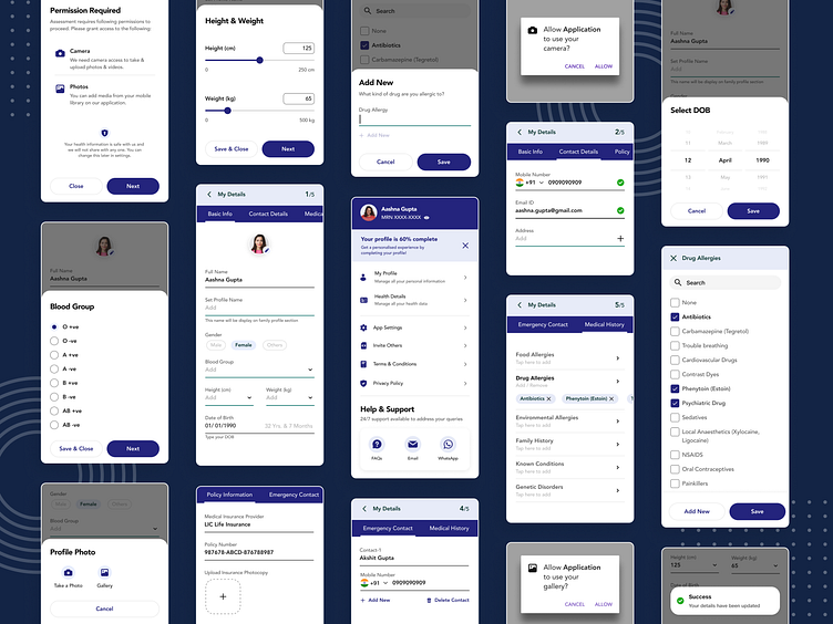
Profile Page Concept
I worked on this feature designed to streamline the user profile creation, completion, and update process within a healthcare app and contribute to a more personalized and engaging app experience. This user-centric feature leverages design heuristics and lean design thinking principles, prioritizing ease of use and clear guidance.
Understanding User Needs :-
Completing lengthy and complex user profiles can be tedious and frustrating for users. I conducted user research to identify key pain points, which revealed a desire for;
Simplified Questionnaires: Streamlined and focused question sets to avoid overwhelming users with information overload.
Progressive Disclosure: Gradual unveiling of questions to maintain user engagement and make the process less daunting.
Clear Progress Indicators: Visual cues to showcase progress and motivate users to complete the profile.
Accessible Input Methods: User-friendly interfaces for entering sensitive information like DOB and drug allergies.
Flexibility: Ability to revisit and update profile details easily.
Design Heuristics & Lean Thinking in Action :-
1. Progressive Disclosure Stepper Approach
I designed the profile creation process using a stepper format with toggle tabs.
Users progress through sections like 'Basic Info', 'Medical Info', 'Policy Details', and 'Emergency Contacts' in a step-by-step manner.
This approach helps users prioritize key information and avoids overwhelming them with a single, lengthy questionnaire.
2. User-Friendly Progress Tracking
A prominent numeric indicator in the top right corner displays the number of completed sections out of the total remaining.
Additionally, a completion percentage nudge further incentivizes users to complete their profiles.
3. Accessible Input Methods
Leverage accessible bottom sheets for intuitive data entry, similar to the iOS date-of-birth selection experience.
Utilize radio buttons for clear blood group selection.
Implement a multi-select checkbox system for drug allergies, along with an option to add new allergies not listed.
4. Flexibility in Customization
Users can upload a profile picture to personalize their app experience.
Height and weight can be easily adjusted using user-friendly sliders.
Gender selection is made simple with a clear toggle button.
5. Profile Management & Privacy
A dedicated profile page within the app allows users to easily review and update their details at any time.
Users can access the privacy policy and terms & conditions directly from their profile page.
A readily available contact support option empowers users to seek assistance if needed.
The User Experience :-
Progressive Disclosure: Answer questions in manageable sections, avoiding information overload.
Real-time Progress Tracking: Stay informed about your profile completion progress with clear indicators.
Intuitive Input Methods: Easily enter data like DOB, blood group, and drug allergies using accessible interfaces.
Customization Options: Personalize your profile with a profile picture, height, weight, and gender selection.
Effortless Management: Review and update profile details at any time from the dedicated profile page.
Transparency & Control: Access privacy policies, terms & conditions, and contact support for a secure and informed experience.
--------------------------------------------------------------------
Do check out my other work & let me know how y'all found this one ! 😄✌❤
