Letterpress

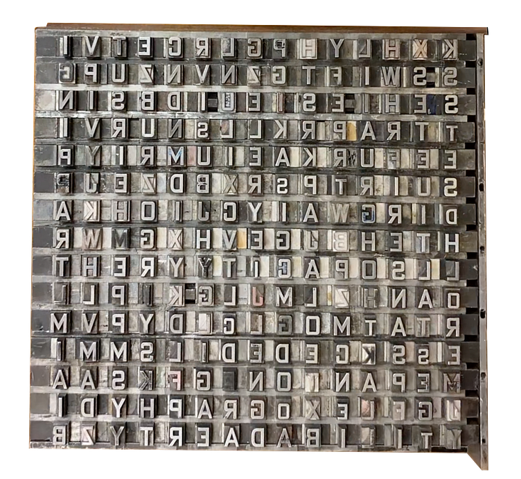
Leading and Kerning
Printed with a Chandler & Preston printing press, the word search
project was a practice in leading, the spacing between lines, and kerning,
the spacing between characters. After the subject words were elected, a word
scramble with the correct parameters was made from an online generator.
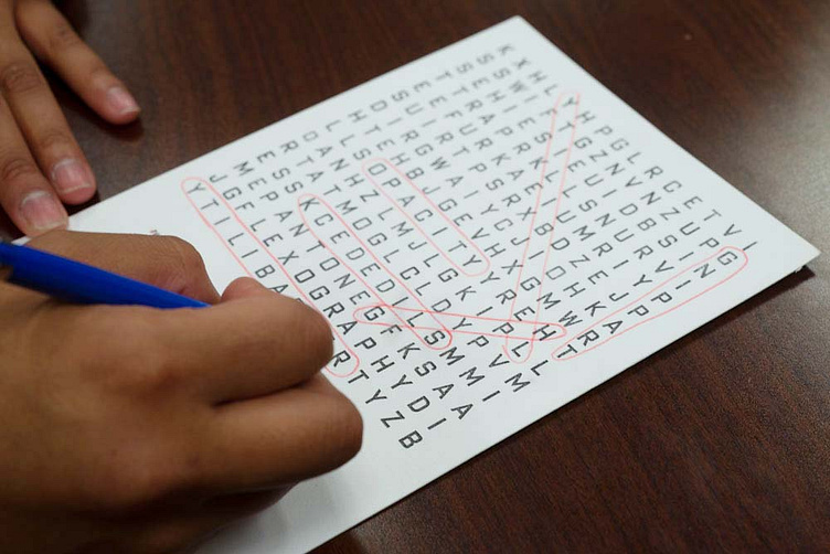
Beginning from the top row, each row of letters was taken from the 18 point Bank Gothic Condensed drawer of metal type until 225 characters made up a jumbled square. The next step was to arrange the characters into an equally spaced grid. This was done using 18 point spacers of varying widths to equalize the distance between each character and make the columns, rows, and diagonals readable. A key showing the subject words was also set and printed in a smaller typeface on the bottom third of the paper.
Quote Card
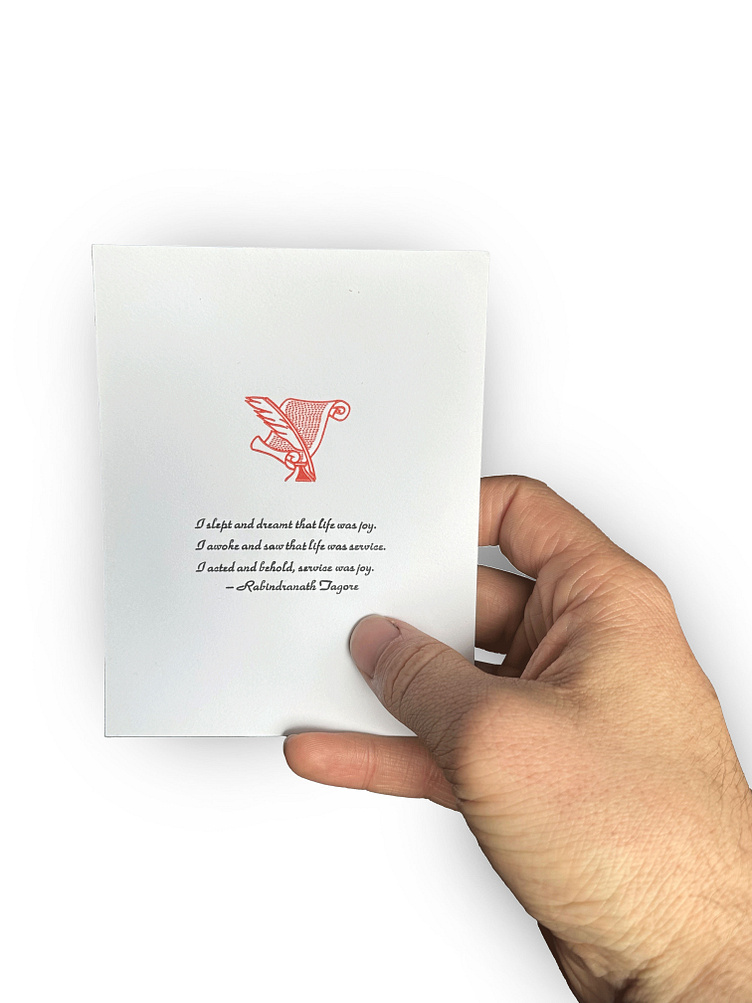
As a study in small typesetting, a two-color card was printed with a quote and a graphic. Smaller fonts, such as this 10-point, is set using tweezers because it is so small. Good leading is essential
to the quotes fluidity over several lines.