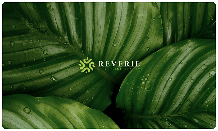
Branding Design for Organic Cosmetics Brand
R E V E R I E
B R A N D I N G D E S I G N
Project Overview: Reverie is a brand dedicated to organic beauty and cosmetic products, with a focus on nurturing beauty naturally. The goal of this branding project was to create a visual identity that reflects Reverie's ethos of care, love, and nature.
Brand Name: Reverie
Slogan: Nurturing Beauty
Logo Design: The logo features a unique combination of elements to convey the essence of Reverie. The use of a half-heart shape symbolizes care and love, while also incorporating the letter "R" for brand recognition. The inclusion of a leaf represents the natural ingredients used in Reverie's products.
Color Palette: The color palette was meticulously chosen to reflect the organic nature of Reverie's offerings. Two shades of green represent freshness, growth, and sustainability, while orange accents highlight the vibrant, natural ingredients used in the products.
Design Concept: The design concept focuses on simplicity, functionality, and a connection to nature. The overall rectangular shape of the branding materials allows for easy product placement, while also conveying a sense of modernity and professionalism.
By incorporating these elements, the Reverie branding project captures the essence of organic beauty and sets the brand apart in the cosmetics industry.


