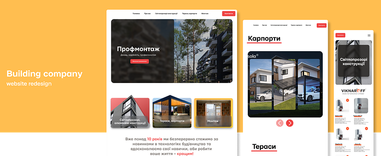
Website redesign for a building company UI/UX
Main task was to change the design of a current website into something more modern and appealing.
Company specializes on installing and distributing translucent, aluminum structures as well as terraces, carports. Blocks with images and videos were made to visually represent windows and design overall uses more square-like forms.
Beautiful and functional
For each construction you can find useful information about the product and some more details by pressing the dedicated button.
Good design = Responsive design
artem.diakunchak.work@gmail.com
More by Artem Diakunchak | UI/UX design, WEB dev View profile
Like
