Benek Responsive Case Studies
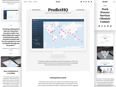
One thing I really strived for with my new portfolio design was a super clean, minimal, monochrome presentation so the screenshots of my work could do the talking with any distraction or extra ornamentation.
I don't like how some people try to spice up their work by rendering nifty 3d views, complex background graphics or added imagery, all that shit that's really popular on Behance.
I wanted to do the opposite and present my work in the most honest way possible. I want people to get a real insight into the kind of work I produce, not just how trendy and viral I can make a long-form case study image for Pinterest.
So I made the screenshots big - native resolutions for desktop, tablet, and mobile screenshots so I could show them without resizing or blurring when possible - simple text, a few blockquotes, and nothing else.
How do you think it works? Hit "L" if you like it.
View my new portfolio and tell me what you think: http://benek.nz
Follow me | Website | Behance | Pinterest | LinkedIn | Twitter