AstroTalk: Reimagining the Astrologer Profile Screen
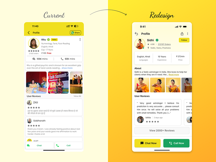
I recently redesigned the astrologer profile screen for the AstroTalk app, focusing on improving user experience (UX) and clarity through design principles and UX laws.
The original design (left) presented information in a way that was cluttered and difficult to scan. To address this, I implemented the following changes in the redesigned version (right):
Clear hierarchy and information architecture: I reorganized the layout to prioritize key details like specialities, languages, price and experience.
Visual hierarchy and user guidance: I used larger fonts and icons to draw the user’s eye to the most important information.
Improved readability: I increased white space and used a more neutral colour scheme to enhance readability.
Increased visibility and size of call/chat buttons: I made the “Chat Now” and “Call Now” buttons larger and more prominent, allowing users to easily connect with an astrologer.
Actionable buttons: I made the “Chat Now” and “Call Now” buttons more prominent and easier to find.
By implementing these design changes, the new AstroTalk astrologer profile screen is not only more visually appealing but also easier for users to navigate and find the information they need to make informed decisions when choosing an astrologer.
I would love to hear your thoughts on this redesign!
Ready to transform your next project with impactful design? Let's connect: sagarsingh1897@gmail.com. Discover more on my Behance Profile.

