Wealthy - Case Study
Let me explain the app with a story.
This is Janet and her daughter Cali. Recognizing her own discomfort around money, she is interested in teaching her daughter from a young age. In her search she learns of Wealthy; the app that teaches whole families essential money skills.
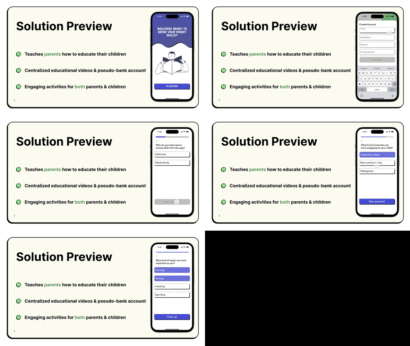
Janet works her way through Wealthy's on-boarding where she is asked questions about her own comfort with money, and what topics she values most.
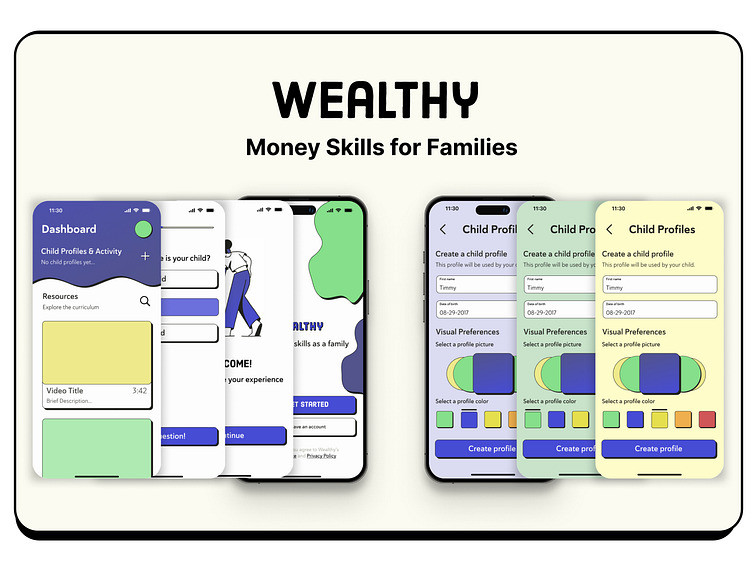
Janet follows the on-boarding until she reaches the child account creation and is prompted to continue with her daughter. She brings Cali over so they can choose her account colors and a profile picture.
Creating the profile leads the both of them to an engaging introductory video that get's the pair excited for the journey they are both about to go on.
They complete the first lesson together, watching an interactive video that teaches Cali what money is, and completing a game that illustrates her understanding of the concept.
After just a few weeks of steady progress Janet is notified that Cali is ready to take what she's learned to the real world. Janet sets up a small $10 deposit for an early bank account, and orders a card.
Janet takes Cali with her new card to a local ice cream place to let her buy them dessert. Excited, Cali pays for her own food for the first time, instilling confidence.
Just a month after beginning, both Janet and Cali have learned foundational money skills for budgeting, saving, and investing. Janet has found comfort around money, and confidence that she's teaching Cali well.
Process
After conducting initial research, analyzing competitors, and interviewing two parents, I formulated these "How Might We?" questions. If properly addressed and integrated into the product, they help ensure a certain degree of effectiveness.
Secondary Research
One of the first steps I took was a competitive analysis to understand the market and determine opportunities for improvement or to see if there was no viable niche for this product. Through this exercise, I identified a gap in services that offer both educational and practical tools for entire families. Leading me to shift my focus.
Primary Research
Personas
Informed by interview and survey responses.
I employed personas to broaden the scope of the project and to ensure the design and functionality was inclusive for a wider audience. These personas introduced variables that shaped the project, including parents who are uncomfortable with financial concepts themselves, those who are financially savvy but struggle to teach these skills, and children older than our target age of 13. Additionally, some personas represented parents seeking a shared activity with their children and those leading busy lives who prefer not to invest substantial time in the app. These diverse needs guided the development to cater to a variety of family dynamics and educational backgrounds.
Storyboard
I used a storyboard early on as an exercise to develop the sequence of events and outcomes I hoped for Wealthy to achieve, doing this guided my ideation.
User Journey
Running through a similar scenario with one of the personas helped in identifying which steps in the process might need the most attention, and which have the greatest opportunity for success.
Ideation
Designs
User Testing
I did 3 rounds of user testing with 15 people using Figma prototypes:
First after creating an interactive, low-fidelity prototype.
After about half of the high-fidelity screens were finished and added to the prototype.
Third time after changes had been implemented, and all screens were high-fidelity.
The following details my tasks, insights, and solutions.
Styles & Components
If I could go back...
In planning for my primary research, I missed the opportunity to measure benchmarks to help me measure the design's success. I set objectives, but I failed to outline the key results that quantify the effectiveness of my work.
Thank you!
Learn more about me here.


