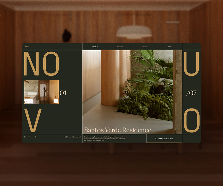
Architecture Studio landing page concept
This concept is inspired by the beautiful work of Estudio BRA from Brazil, which I discovered on ArchDaily. I used a muted dark desaturated green to create an elegant and moody style for the studio, while using some brighter gold and off-white for the accents and typography. This balance is inspired directly from the projects, where the studio uses warm materials combined with concrete and a minimal approach to architecture.
Check their studio out!
More by Quentin Caron View profile
Like
