LPAlpha | Logo Options
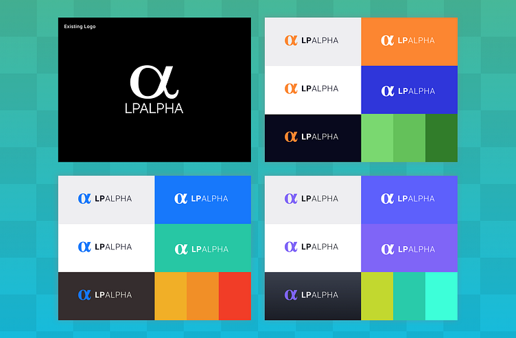
Here are three logo and color palette options I created for startup LP Alpha based on their existing logo.
The existing logo was stacked, which made the words very small on mobile. It was difficult to read and lacked color options.
More by Kate Meyer View profile
Like


