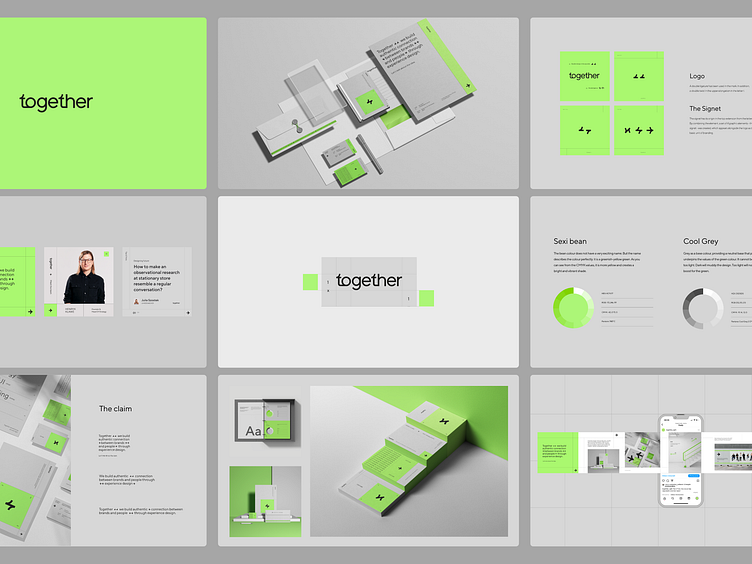
Together UX/UI Agency branding
LOGO - A double ligature has been used in the mark - it is th.
In addition, a double twist in the upper elongation in the letter t.
The signet has its origin in the top extension from the letter t. By combining the element, a set of 4 graphic elements - the signet - was created, which appears alongside the logo as the basic unit of branding.
More by Teresa Chylińska-Kur View profile
Like


