UI Challenge - Day 11 (Explore and Discover)
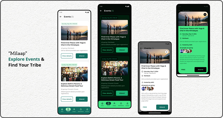
For Day 11 of my UI Challenge, I designed two screens for Milaap, a (hypothetical) mobile app that connects people through local events in India.
Screen 1: Discover Upcoming Events
Clean and modern interface: Light and dark theme options cater to user preferences.
Event Cards:
Quick Glance: Pill-shaped date & time indicators for easy scanning.
Engaging visuals: High-quality images preview each event (e.g., yoga in the Himalayas).
Clear Information: Titles, attendee count, and venue with a registration detail note.
Actionable CTAs: "Attend" button for quick RSVP and "View details" for deeper exploration.
Accessibility: WCAG compliant color contrast ensures readability for all users.
Screen 2: Event Details (Overlay)
In-depth Information: Detailed description, organizer profile, and complete venue details.
Seamless Navigation: Easy exit button for returning to the event list.
Overall, this design prioritizes discoverability, clarity, and user experience to help people find and connect with events that spark their interest.
Tools - Figma
#Milaap #UIChallenge #EventApp #India #MobileApp
Feel free to follow my work for more design explorations:
Looking forward to connecting!


