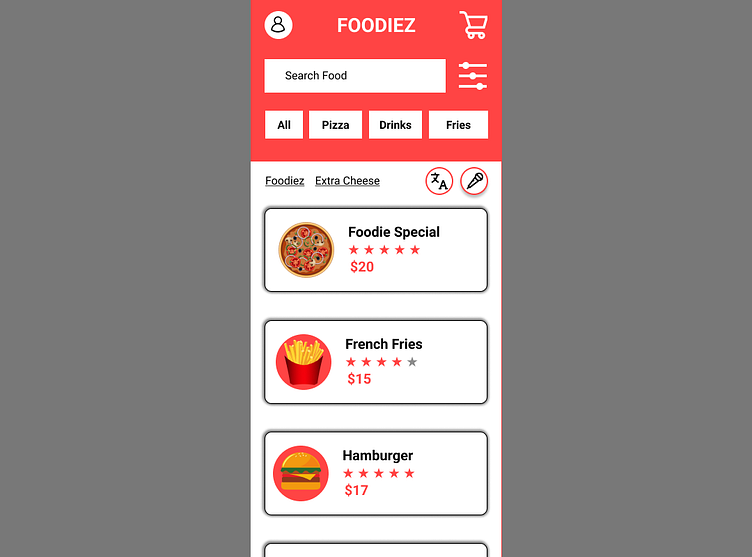
FOODIEZ Fast Food Delivery App
Good User Interaction is the main objective of this design while using #ff4444 which is close to red & orange. Combined with white color to improve accessibility. The prototype is easy to follow and any feedback would be apperiaciated.
Here is the link to the prototype
The design is drawn thanks to the help of Google UX Design Professional Certification. https://www.coursera.org/professional-certificates/google-ux-design
More by Mian Hamid Ur Rehman View profile
Like
