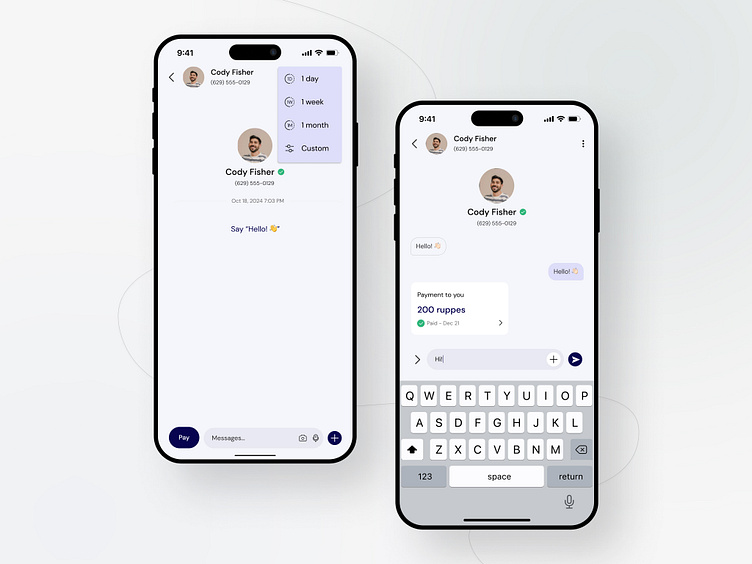
Message and payment screen design concept
Are you ready to enhance the user experience of the Message and payment screen design concept
What do you think? Please let me know in the comment section!
Feel free to leave feedback and don't forget to press (L) and don't forget to follow @urvikdesign dribbble account to get lots of awesome mobile and web design!
🚀 Excited to share my latest #UI design concept on Dribbble! 🎨 Check out this sleek Message and Payment Screen design that's perfect for any e-commerce app! 💳💬 With a clean and intuitive layout, users can seamlessly communicate with sellers while effortlessly managing transactions in one place. 💼
✨ Featuring trendy color schemes and minimalist icons, this design is sure to captivate users and elevate their shopping experience! 🌟 Don't miss out, give it some love and let me know your thoughts in the comments! 👇 #UIUX #DesignInspiration #DribbbleShot #Ecommerce #DigitalPayments
Expertise In
App design - Website design - Development - Branding - Art Direction
Digital Product - Gumroad
What is your thought about the design comment down below 👇
🚀 I'm available for new projects! Tell us more at urvikmoradiya@gmail.com
Let's work together!
