J&T Express Mobile App Redesign
About J&T Express
J&T Express is a multinational company headquartered in Jakarta, Indonesia. The company was founded on August 20, 2015. The company is engaged in the field of expedition.
Currently, J&T Express has more than 4,000 agents or points of service, with more than 30,000 trained employees.
What is They’re Problems? 🤔
In the initial phase of this project, I focused on identifying usability issues by reviewing their app store reviews. And here's the result 👇
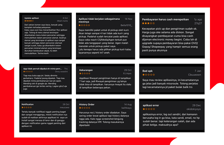
My research suggests that users are struggling with :
The order history that is not displayed based on the time filter and only shows history for a few weeks confuses users when searching for orders that do not appear in the history.
The limited payment methods make it difficult for users during payment.
There is no place to store addresses, so users have to repeatedly check previously saved addresses.
The points on the application are not clear enough, making it difficult for users to find the correct address.
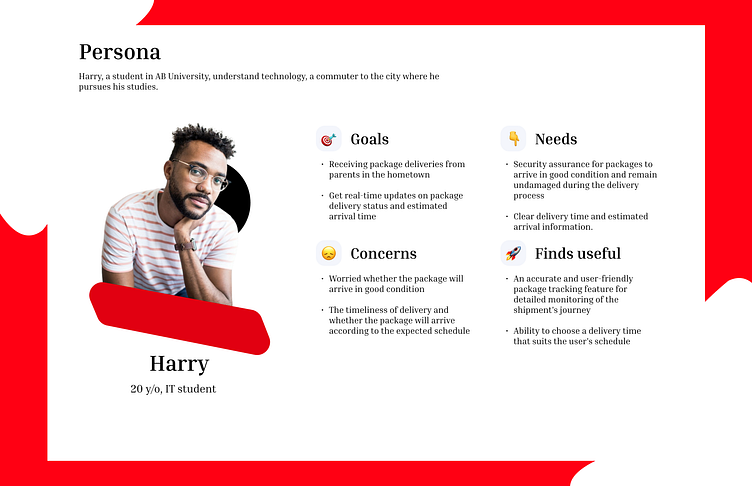
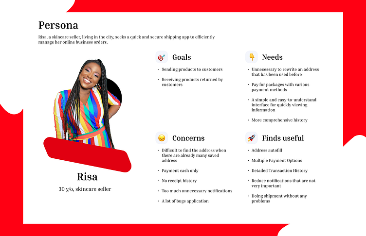
To truly step into the shoes of our users and understand their pain points, I created empathy boosters: User Personas! ⭐️
Let's Brainstorm Some Fixes! 💡
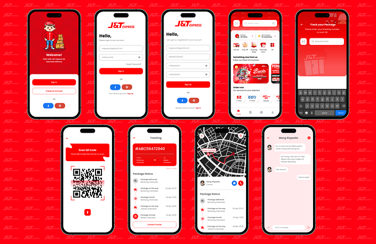
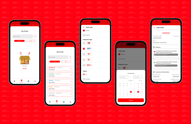
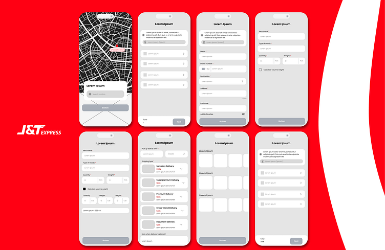
Creating order history based on order type, shipment type, status, and order date filters to make it easier for users to obtain order history information according to their preferences.
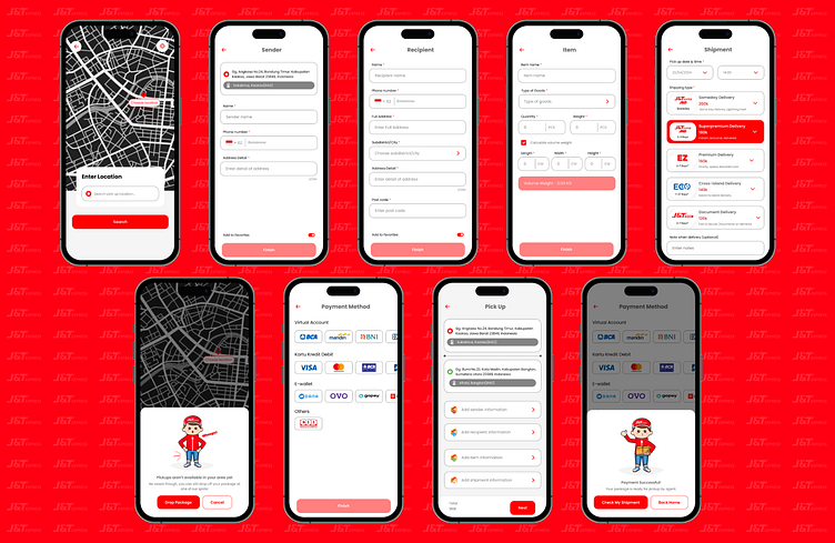
Adding payment options such as virtual accounts, debit/credit cards, e-wallets, and other payment methods to facilitate users in paying for their orders.
Implementing a button for users to save addresses by marking them as favorites and easily accessing them on the homepage, eliminating the need for users to recreate addresses they have previously used.
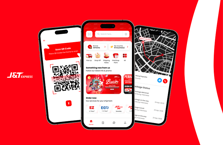
Ensuring that map markers are as clear as possible and encouraging users to provide complete address information in the address information form. Additionally, I have redesigned the pick-up and drop-off process by adding shipment information to allow users to select shipments according to their needs.
Furthermore, I have redesigned the UI by introducing new illustrations depicting a J&T Express courier. I have also made several visual changes to enhance the attractiveness of the application without compromising user convenience. The color scheme used remains consistent with the previous J&T Express mobile application.
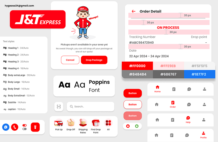
Design System 🌟
Here's the design system to make my design more consistent.
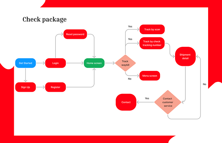
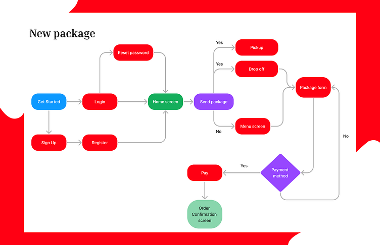
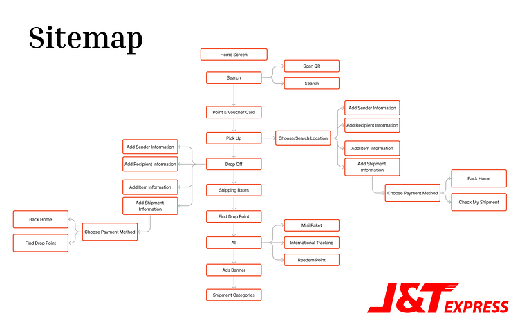
Information Architecture ✍🏻
Here's the user flow to make a new order and check their package.
I also create a sitemap as a map that details each page in this application.
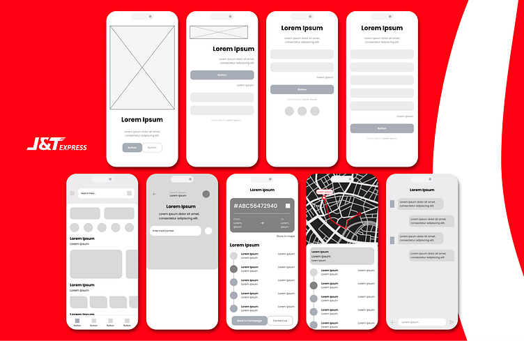
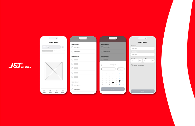
Pencil Meets Figma! Time to Craft the Wireframes! ✎
Bringing the Design to Life: High-Fidelity Prototyping 🚀
I'm currently creating a high-fidelity design for the app and prototyping it using Figma. To experience the interactive prototype, you can try below :
Ready, Set, Feedback! 💌
I'd love to hear your thoughts on the UX Case study I've presented. Feel free to share your feedback or suggestions in the comments below, or reach out to me directly via email at hygeasa24@gmail.com.
