UI Challenge : Day 10 (User-Friendly Password Flow)
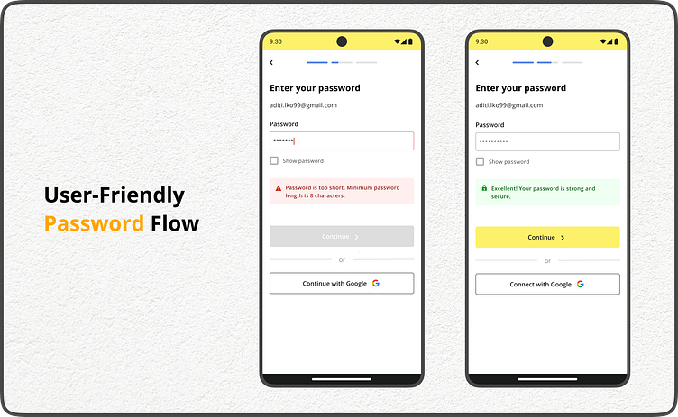
This design streamlines the password creation process, offering clear feedback to guide users towards secure logins.
Screen 1 (Invalid Password):
Red bounding box highlights the password field for immediate attention.
Text: "Password is too short. Minimum 8 characters." (Clear and concise)
Screen 2 (Valid Password):
Lock icon indicates a strong password.
Text: "Excellent! Your password is strong and secure." (Positive reinforcement)
Key Features
Clear Error Messages: Inform users about password requirements without frustration.
Visual Cues: Utilize color and icons to guide users easily.
Positive Reinforcement: Motivate users for creating strong passwords.
Disabled CTA (optional): Ensures users meet password requirements before proceeding.
Alternative Login Option: Allows users to login with Google for convenience.
Benefits
Improved user experience with a clear and intuitive password flow.
Increased security by encouraging strong passwords.
Reduced user frustration with helpful error guidance.
#UI #UX #Design #Password #Security #Usability
Feel free to follow my work for more design explorations:
Looking forward to connecting!


