How to Create Effective Diagrams for Research Articles
Science is all about observations and findings, but sometimes it can be challenging to convey those findings in words alone. So, scientific illustrations are essential for conveying complex information in research articles. A well-designed illustration can enhance the impact of your research by providing a clear visual representation of your findings. In this article, we will explore some best practices for creating effective scientific illustrations that can help communicate your research to a wider audience.
1. Understand the purpose of the illustration
Before you start creating an illustration, it is important to understand the purpose it serves in your research article. The illustration should support the text and help the reader understand the key concepts you are presenting.
A scientific illustration is a visual representation of scientific information, and it serves a specific purpose, such as explaining a concept, demonstrating a process, or presenting data. Therefore, before creating a scientific illustration, understanding the purpose of a scientific illustration is essential because it helps guide the creation process, ensuring that the illustration effectively communicates the intended message to the appropriate audience in the desired context. For example, an illustration that aims to explain a complex process might require more detailed and step-by-step illustrations than an illustration that presents data.
Consider what information you want to convey, and how the illustration can help communicate that information more effectively. Ask yourself, what am I trying to show in this diagram (e.g. a process, a summary, the structure of something)? Then you can move onto the planning stage.
2. Plan the diagram
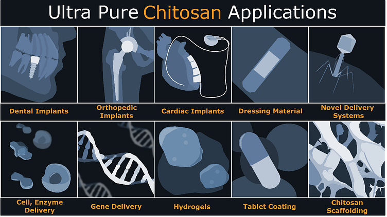
Especially when using a vector graphics software, it can take a lot of time to develop illustrations. So you may want to sketch out the diagram on paper or a whiteboard before starting the digital version. PowerPoint may also work for this purpose – you may want to just copy and paste images from the internet and lay them out on a slide to get a feel for the diagram. Taking the time to plan out the diagram or illustration before beginning can save time and effort in the long run and result in a more professional-looking and effective final product. Sometimes it’s as simple as figuring out how many elements to include so that you get an event number. For example, in this diagram I created (see below), an extra application of ultra-pure chitosan would have been annoying to fit in!
One of the most critical aspects of a scientific diagram is accuracy. Scientific diagrams and illustrations must be accurate representations of the data being presented. Without proper planning, there is a high risk of inaccuracies and misrepresentations. Careful planning ensures that the diagram accurately represents the data and information being conveyed.
Furthermore, ensuring that you have the clarity and flow of your diagram right is essential. A well-designed scientific diagram should be easy to understand and interpret. People usually start at the top right and move to the bottom right, just like with text. So consider this when laying out the elements of your diagram.
Finally, planning out a scientific diagram or illustration can ensure that the final product is accessible to a wide range of audiences, including those with visual impairments. By considering accessibility during the planning phase, the creator can make necessary adjustments to ensure that the final product is accessible to all readers.
Here are some examples of diagrams that have planned out on paper by myself or a client, and then how I ended up creating them:
It is also important to consider the context in which your illustration will be viewed. Consider the size and orientation of your illustration in relation to the overall layout of your article. Make sure that your illustration is legible and clear, even when viewed at a reduced size. If your illustration will be printed in black and white, make sure that it is still easy to understand without relying on color.
3. Study the journal requirements
Always check the journal requirements before starting the diagram. Each journal has their own way of doing things and ensuring that you follow these requirements will save you time when you come to submit, and may save time reformatting figures prior to submission.
Nature provides a useful info sheets for figure requirements (they are very picky about file type, file size, fonts, and editability), while Frontiers has step by step journal requirements listed on their site, see https://www.frontiersin.org/guidelines/author-guidelines#figure-and-table-guidelines.
4. Use appropriate tools
There are many different tools available for creating scientific illustrations, including digital software, hand-drawn sketches, and photography. Choose the tool that is best suited for your needs and experience level.
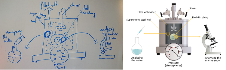
Vector graphics software is best for creating high quality diagrams, and Adobe illustrator is the king when it comes to vector graphics. But if you’re not familiar with Adobe Illustrator then consider alternatives like Inkscape, which is a totally free vector graphics software with a very friendly user interface. Also, don’t be afraid to use PowerPoint if that’s what you’re comfortable with. As a demonstration of PowerPoint’s illustrative power, check out this diagram I managed to create using just PowerPoint:
Avoid using software designed for sketching or painting as it is more challenging to generate editable figures. Journals like to receive figures with editable text, and shapes in individual elements so that it’s clear how the diagram was generated. Being able to provide a source file (e.g. .ppt or .svg) can be a lifesaver for a journal editor.
You may also need other software and tools to help you out with picky submission requirements (e.g. converting figures to pdf, changing file sizes and resolutions etc.). The best hub for these kinds of tools on the internet is tinywow.com, which has tools for editing and converting pdfs, image files, and videos, and it is totally free.
5. Choose the right level of detail
When creating an illustration, it is important to strike the right balance between detail and simplicity. Too much detail can make the illustration difficult to read and overwhelm the viewer, while too little detail can obscure important information. Consider the purpose of the illustration and the level of detail necessary to communicate the key concepts effectively.
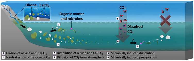
Look at these two illustrations and consider (a) which is more likely to communicate the main findings of your paper to the reader (b) which the reader is more likely to actually look through:
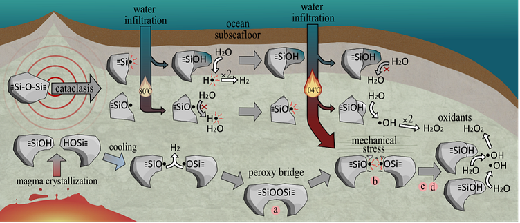
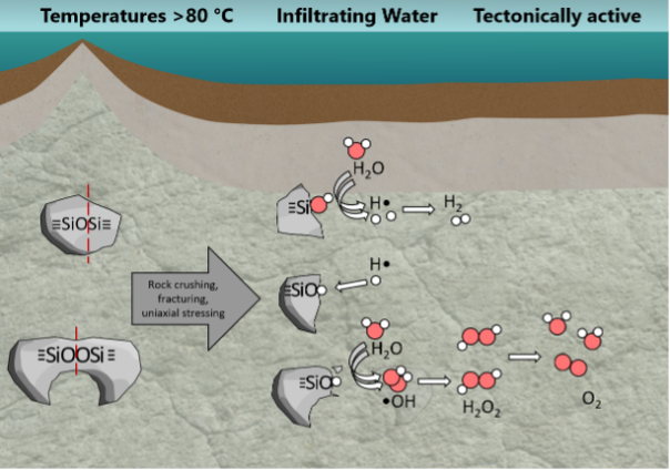
This links back to understanding the purpose of the illustration. In this example, the main purpose is to show the mechanisms to generate H2 and O2 by mechanochemical reactions. The first illustration includes unnecessary details on the formation of surface defects and silanols (SiOH), which distracts from the main purpose of the diagram.
6. Use appropriate labelling
Labelling is critical for ensuring that your illustration is easy to understand. All labels should be clearly and consistently placed, and any abbreviations or symbols used should be explained in a legend or caption. Make sure that any units of measurement are clearly specified.
Sometimes you can put labels straight onto the illustration, while other times you might want to put a box around the text. Think about whether it may be easier to use numbers (referenced in the figure legend) to reduce cluttering in your diagram.
7. Use appropriate colours
Colours can be used effectively to highlight key information in an illustration. However, it is important to use them sparingly and effectively. Avoid using too many colours, which can make your illustration look cluttered and confusing. Use a minimal colour palette and consider using shades of gray to provide depth and contrast.
Also consider people who may be colour blind. You can find many colour blind friendly colour schemes online.
Finally, avoid using white text! White text often makes the text harder to read and can make the diagram look unprofessional. Most journals will just outright reject diagrams with white text.
Summary
In summary, creating effective scientific illustrations requires that you begin with understanding the purpose of the illustration, plan it out, study the journal requirements, use the appropriate tools, choose the right level of detail, and make sure you use appropriate labelling and colours. By following these best practices, you can create illustrations that enhance the impact of your research and help communicate your findings to a wider audience. Best of luck!
This article was written by Jordan—a scientific illustrator at Eloquenti—and was originally posted on the Eloquenti Blog.
