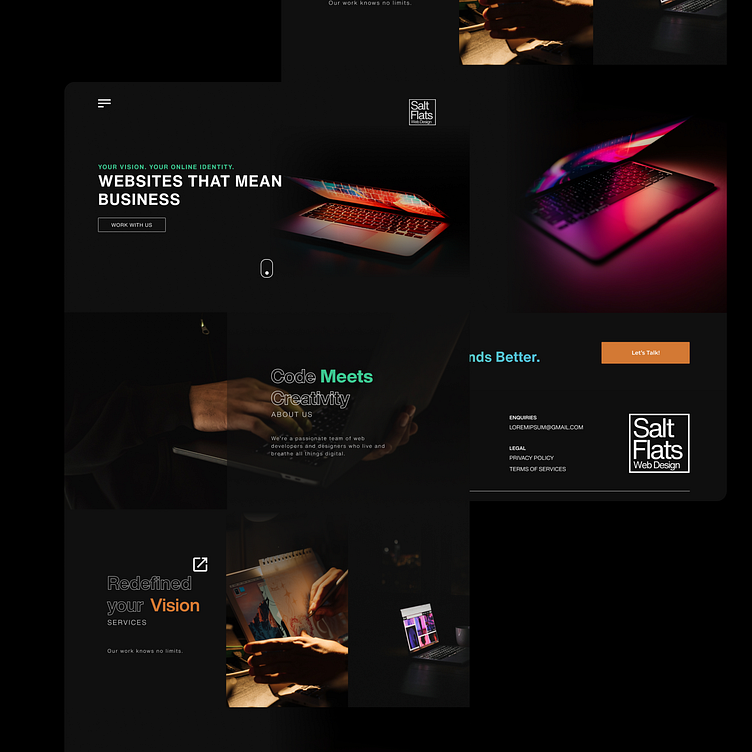
IT Solution Landing Page
Choosing your minimal IT Solution Landing Page design offers several advantages:
Simplicity and Clarity: Minimalist designs often focus on essential elements, reducing clutter and distractions. This clarity helps visitors quickly understand your IT solutions and services without being overwhelmed.
Professionalism: A clean and well-executed design reflects professionalism and expertise. It creates a positive first impression, establishing trust and credibility with potential clients.
User Experience: Minimalist designs prioritize user experience by making navigation intuitive and content easily accessible. Visitors can find the information they need quickly, enhancing their overall experience on your website.
Faster Loading Times: Minimalist designs typically have fewer elements and lighter graphics, leading to faster loading times. This is crucial for retaining visitors and improving search engine rankings.
Adaptability: Minimalist designs are often more adaptable and responsive across various devices and screen sizes. This ensures a consistent and enjoyable experience for users accessing your website from desktops, tablets, or mobile devices.
Emphasis on Content: With fewer distractions, the focus is on your content and messaging. This allows you to effectively communicate the benefits of your IT solutions and engage visitors with compelling copy and visuals.
Brand Identity: A minimal design can still convey a strong brand identity through strategic use of colors, typography, and imagery. It allows your brand to shine without competing with unnecessary design elements.
Overall, your minimal IT Solution Landing Page design offers a clean, professional, and user-friendly experience that effectively showcases your IT solutions and encourages visitors to explore further or take action.
contact me @ arcdc.freelance@gmail.com

