Dating App UI
💌 Have a mobile app idea? We are available for new projects!
hello@ronasit.com | Telegram | WhatsApp | Website
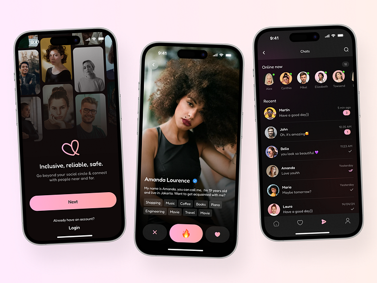
Hello everyone! Our team has crafted a design concept for a dating and socializing app that helps users create meaningful connections.
An onboarding screen introduces users to app features. The second screen presents a feed of user profiles, allowing for easy browsing. The third screen is dedicated to the latest chats and a list of online users, enhancing interactions and immediacy.
We opted for a dark theme with pink accents, striking a balance between sophistication and vibrancy. This color scheme is designed to provide a comforting and engaging user environment.
The key characteristic of this design is its intuitive interface. This approach ensures that any user, regardless of their tech-savviness, can easily navigate through the app, making the process of finding and connecting with others straightforward and enjoyable.


