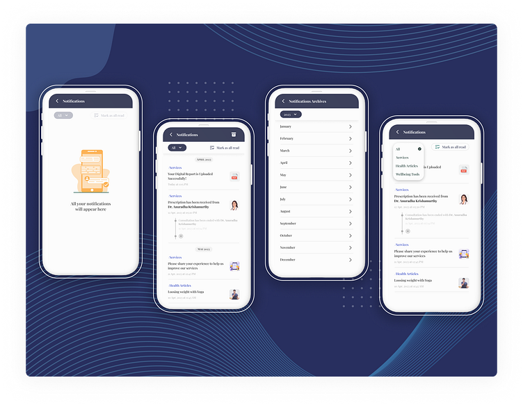
Notification Tracker
I worked on the UXUI for this mobile feature to enhance user experience within a healthcare app. This feature leverages design heuristic principles and a lean design thinking approach, putting user needs at the forefront.
Understanding the Problem :-
Traditional mobile notifications can be fleeting. Users may miss important healthcare information or accidentally swipe them away. This can lead to confusion and a lack of awareness about crucial updates or reminders within the app.
Design Heuristics & Lean Thinking in Action :-
1. User Research & Empathy
I conducted user interviews and surveys to understand user pain points regarding app notifications.
Key findings revealed a frustration with missed notifications and the desire for a centralized location to access all app-generated messages.
2. Defining the Need
Comprehensive Notification Log: All app notifications are consolidated into a single, easily accessible view. Users can finally say goodbye to missed or forgotten messages.
Smart Filtering: Users can effortlessly filter notifications based on specific criteria, allowing them to focus on messages relevant to their needs and healthcare journey.
Service Segregation: Notifications are clearly categorized by the app service that generated them. This provides context and helps users understand the purpose of each notification.
Date & Time Stamps: Each notification displays a clear date and time stamp, ensuring users stay informed about the chronology of app communication.
Mark All as Read: Users can conveniently mark all notifications as read with a single tap, saving them time and simplifying their notification management.
Drill-Down View: Each notification acts as a gateway to a detailed view, providing users with the full message content and any relevant actions associated with it.
3. Prototyping & Iteration of the Concept
I created low-fidelity prototypes of the Notification Tracker, focusing on intuitive navigation and clear information hierarchy. User testing played a crucial role in refining the design based on feedback & accordingly the below mentioned features were incorporated in the design.
Centralized Notification Hub: Never miss an important update – all notifications are easily accessible in one place.
Customizable Filtering: See only the notifications that matter most with convenient filtering options.
Clear Context: Quickly understand the source and purpose of each notification with service segregation.
Chronological Order: Date and time stamps keep users informed about the sequence of notifications.
Efficient Management: Mark all notifications as read with a single tap, or delve into specific messages for more details.
Benefits for Users :-
Improved Information Accessibility: Stay informed about all app updates and reminders within a centralized location.
Enhanced User Control: Filter notifications based on personal preferences, maintaining focus on relevant information.
Increased Transparency: Clearly understand the source and purpose of each notification.
Simplified Notification Management: Effortlessly manage and access all notifications from a single view.
Empowered Healthcare Decisions: Make informed healthcare decisions with all relevant app information readily available.
--------------------------------------------------------------------
Do check out my other work & let me know how y'all found this one ! 😄✌❤
