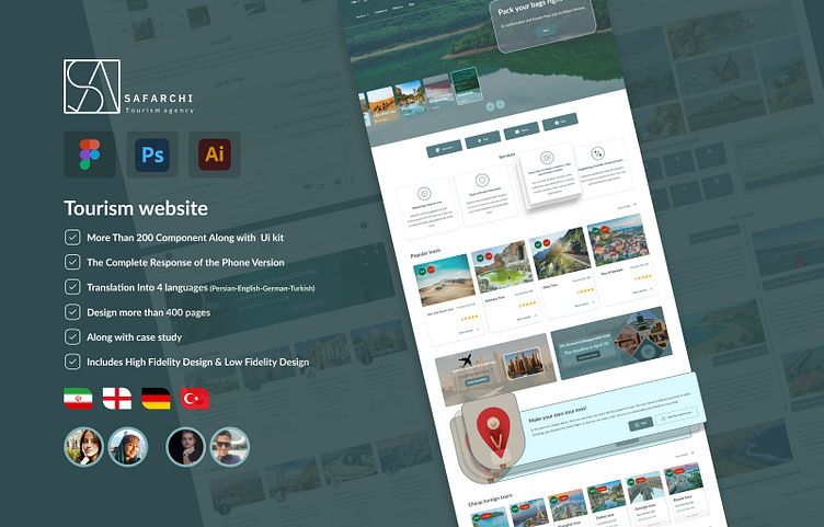
Safarchi Tourism website UI
At this moment, we are very proud to introduce the results of our professional team's efforts to your esteemed presence. The file you are currently reviewing is a User Interface and User Experience (UI/UX) design project for a corporate e-commerce website in the tourism sector, named "Safarchi." The process of creating this project, from ideation to completion, has taken approximately 3 months. In the following, you can see some pages of this project.
It is worth mentioning that Safarchi has been designed in both left-to-right (LTR) and right-to-left (RTL) directions, and in four languages: Persian, English, German and Turkish. This demonstrates the project's flexibility in different languages. Additionally, one of the key hidden aspects of this project is that the design is 100% responsive in two breakpoints, desktop and mobile.
Project link:
https://www.figma.com/community/file/1363583445351998105/safarchi
Case study
One of the strengths of this project is the strong research and presentation of its case study, which I have presented here.
Next, you will see the ticket purchase pop-up and the tour page
Also, this UI-UX project is full of creative components
Our design and creativity team spared no effort in creating this piece, ensuring the project is executed in the best possible manner and highest quality. We hope you enjoy reviewing this work and support us in introducing it even more
effectively and extensively.
Project link:
https://www.figma.com/community/file/1363583445351998105/safarchi
contact with me:


