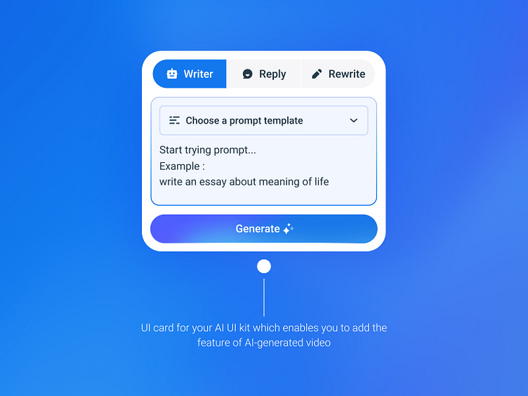
🤖 UI Card for AI Writer Assistant
Hi, people! 👋
After working on the last part, here is responsive version of my exploration about AI Writer App UI. Hope you enjoy it!
Quickly scan familiar icons and understand the context and their function
Make sure that all the icons are consistent and feel like a part of the same family.
The 60-30-10 rule. When you use colors and contrast, you can highlight the importance of information effectively
Thanks for taking a look!
I'd love to hear your thoughts and feedback. Feel free to hit that 'L' or love button if you enjoyed it!
More by Harddy Lab⭐️ View profile
Like


