Komodaa's Home-Feed Redesign

What is Komodaa?
Komodaa is a social commerce platform based in Iran, boasting a user base of 3 million active daily users.
Problem Statement
We received numerous grievances regarding page concepts and functions, prompting us to envision a better product. This involved providing more personalized item suggestions and bolstering social features. Social groups were introduced based on interests, like bookworms and cat lovers, alongside highlighting member activities, such as book discussions and sales.
Moreover, we implemented various improvements to boost user interactions.
Solution Summary
This included redesigning the notification page and integrating the home and feed pages for smoother navigation. Testing new assumptions, like introducing a "businesses-club" category, aimed to elevate the business aspect of our platform.
Other enhancements involved refining the notification page, showcasing activity from followed users, and optimizing banners to serve specific purposes.
Our Customer Experience (CX) team identified areas for improvement during the redesign. For instance, the ratio of liked items to active users was subpar.
To address this, we introduced features like easier liking and a new micro-interaction for efficient item interaction. Making item prices more visible also responded to user feedback on time wasted checking prices.
My Role
As the sole product designer, I collaborated with two product managers, our CX team, and both front-end and back-end developers
This case study highlights our success in adding features users loved while simplifying the product design for better usability and scalability.
Testing
Participants were tasked with various activities, including item search, liking, sharing, joining social groups, and accessing notifications. We employed qualitative methods like observation and interviews, alongside quantitative approaches such as surveys and analytics.
Result
The redesigned pages were deemed more user-friendly and visually appealing. Improved layout and organization facilitated easier navigation. Personalized suggestions and social features were well-received.
Functions
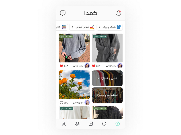
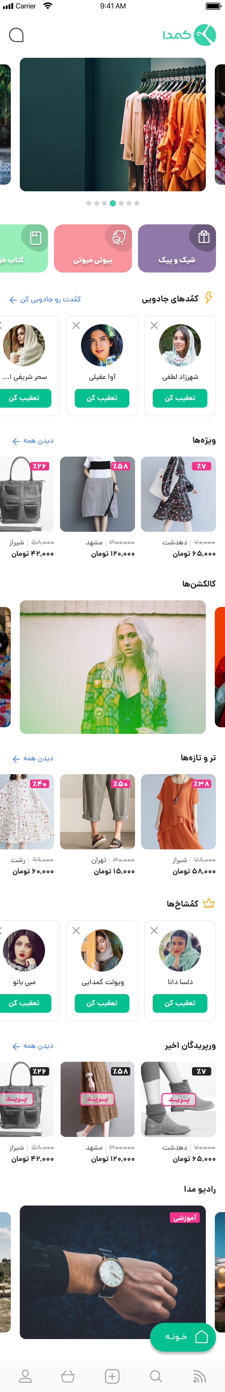
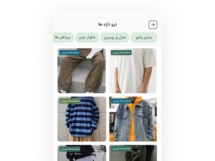
Home-Feed Structure
New patterns for product categories at the top of the home-feed page with smaller sizes
We aim to enhance user experience by displaying product prices prominently, thereby eliminating the need for users to individually access product pages to ascertain pricing information.
By enhancing the accessibility of the "Like" function, users can now like items directly without the need to navigate to the product page.
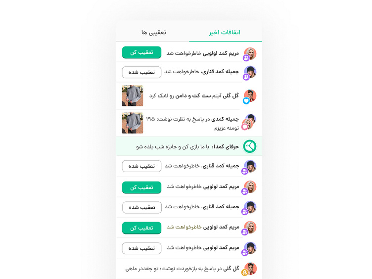
Creating distinct sections for "notifications" and "messages" to improve accessibility and streamline access to each.
Integrating new products, premium products, and premium profiles with similar patterns.
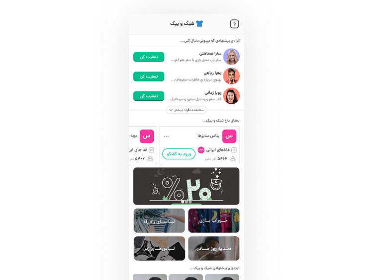
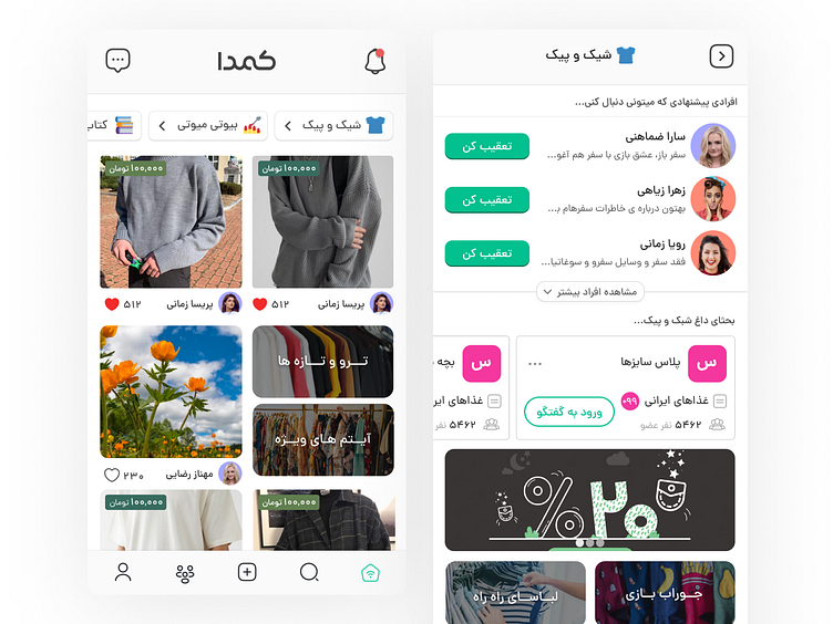
Categories Page
Before redesign, in our product just displayed pictures of related products to each category
In the new design, system shows active users related to each category, enhancing the social aspect of our product.
Added trending groups related to each category to enhance the social aspect of user profiles and provide more opportunities for engagement within our chatroom feature.
Implemented marketing banners for each category, resulting in improved click rates and more targeted advertising.
Introduced new subcategories within each main category, such as the fashion and clothing category, which now includes subcategories like adorable socks.
New / Premium Products
Prior to the redesign, the system only showcased product images in the new products and premium products categories, without displaying their prices.
In the new design, users have the option to select categories for each product, allowing user to easily view goal-oriented products.
Enhanced user experience by displaying product prices prominently, thereby eliminating the need for users to individually access product pages to ascertain pricing information.
Notifications Page
In the new design, helpful notifications are displayed, such as who followed you, who commented on your posts, and who replied to your comments.
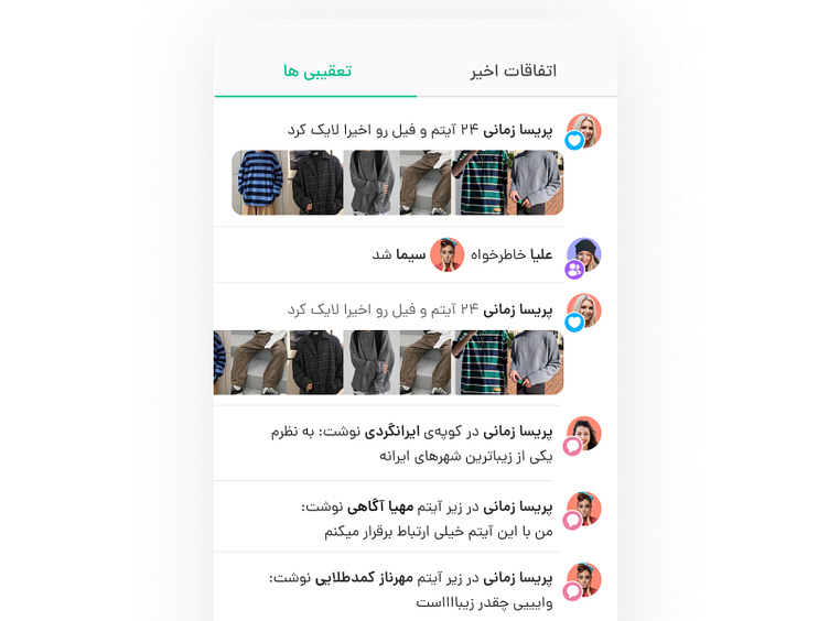
Activity Page
On this new page, our system showcases the activities of users who have been followed by others, allowing all users to view the products and posts they have liked, as well as their comments and more.
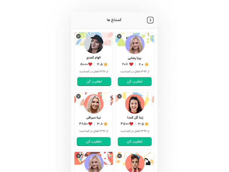
Premium Profiles
Prior to the redesign process, the premium profiles section of our system only presented a list of profiles without any accompanying information, along with the swipe right function.
In the redesigned version of this page, the system now showcases key details for each profile, such as their average customer rating, total number of likes, and the year they commenced their activities, all aimed at enhancing the brand's value.
The old version of the homepage before the redesign👇
Prior to the redesign process, the homepage featured a static structure lacking dynamic data, resulting in diminished user engagement and a high volume of complaints regarding its uninteresting nature.
Decreasing click rate of marketing banners
The previous version of the homepage before redesign had a lower conversion rate compared to the number of views each product received, on average.