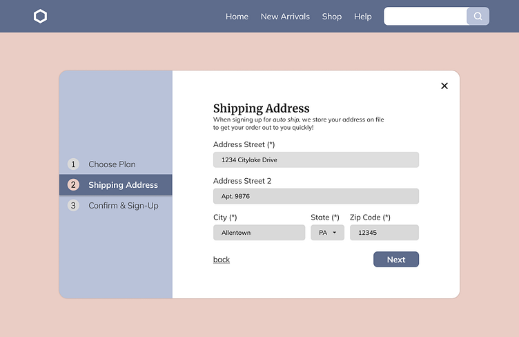
Auto Ship Sign-Up
Day 1/100 of Daily UI
Day 001 Reflection
How can I enhance my UI submissions to include relevant UX problems?
Designing can seem super easy but I wanted to think about this in terms of UX. This includes plain language, relevant form labels, and consistency in corner radii. Great first day!
Introspective Questions
"What kind of information goes on a form? How does a user know where they are in the process of that form? What other CTAs are needed? Does the corner radius of the modal match the form corner size? Is this okay to use in contrast to selected fonts? How are my web accessibility settings for form heights?"
More by Clyde Forland View profile
Like
