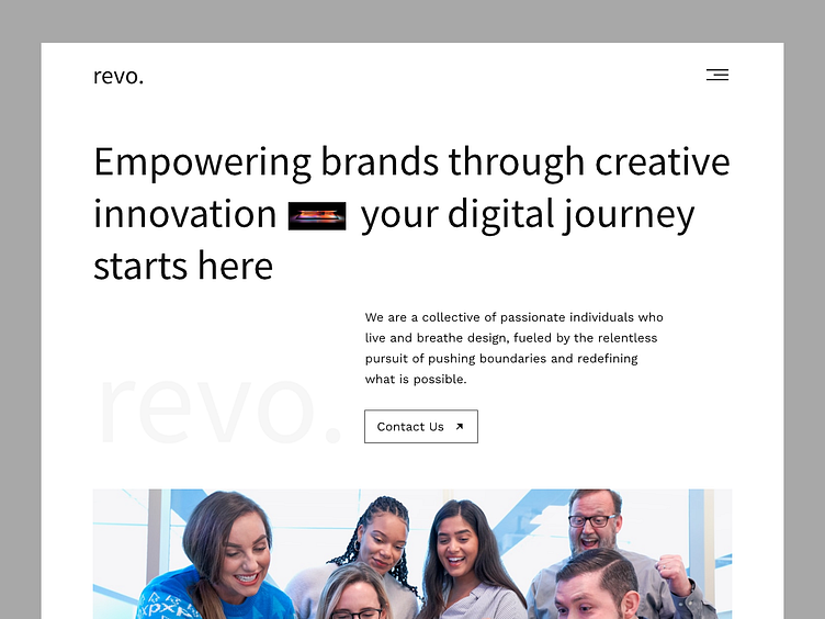
Landing page exploration for revo new website
been trying new style for revo's new website. Using huge font, a lot of white space and combined with my characteristics which is simple, minimalist, elegant. Here's when simplicity meets elegance, minimalism reigns supreme
What do you guys think?
----------------------------------------------------
📩 Contact if you need any custom UI/UX design Services.
🤝 Say Hello: dennypratama194@gmail.com
Design services with subscription-based: tanka
Digital agency services: revo.
More by Denny Pratama View profile
Like

