Skeuomorphic iOS App Icon - Cooking School

1 Hour Design Challenge
I spent an hour creating an app icon for a cooking school using a "trendy style" aka skeuomorphism. Feedback would be greatly appreciated!
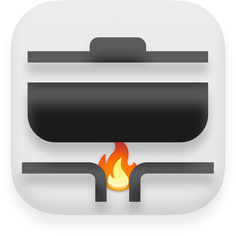
The first take was a flat icon made using a simple background and Material UI icon. The colors were inspired by a local cooking school called "Cooking Fools".

I then added drop and inner shadows to add depth. Plus added a fire icon for fun!
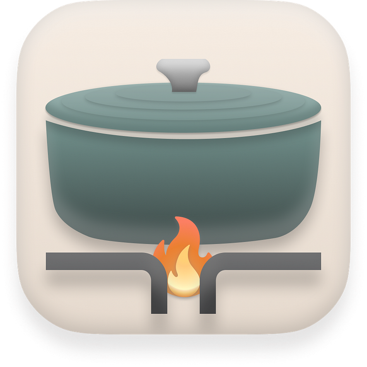
The pot seemed too wide, so I remixed the Material UI icon (aka kept the burner, but deleted the other vectors) and added a different pot icon. I then layered the fire, burner, and pot to add additional depth.

I then tweaked some of the shadows to make the pot seem darker and light seem more consistent.

I’m leaning towards shortening the Y and adding blur to the inner shadow on the pot lid to make it blend a bit better. I’d like to make the pot darker. Maybe I try a darker background? What do you think?
UPDATE: 1 More Hour
I couldn't let this challenge go! The icon wasn't sitting well with me, it was too blocky for what was supposed to be realistic. I illustrated a custom icon inspired by Le Cruset and I think it helps dramatically. I also toned down the colors, including the flames. Thoughts on the latest iteration?