Settings Page
The goal
Reorganize and redesign our client's Settings page, which needed both a tidy up in user experience and interface.
The challenge
Our client's app's navigation was cluttered and important features were tucked away in the Settings, where they were either unclear or misplaced, contributing to user churn. We proposed a re-organization, moving pages and features to create a more logical, hierarchical structure. This effort streamlined the navigation and decluttered the Settings page by effectively tabbing and categorizing each section.
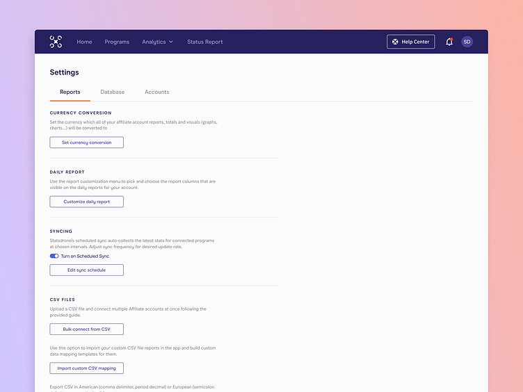
The process
Once we had a working UI kit and system for the redesign, it was a matter of applying UX best practices: first we grouped Settings at a higher level via tabs, to create 3 pages or sections, and within those we followed the same clear structure for each Settings group: header, short explanation beneath, and button. We also ensured that any and all functionality found on this page was actually Settings-related, as our client initially had actual features in there (which moved up in hierarchy to the main navigation as its own thing).
The outcome
The outcome is certainly much more organized, easy and quick to find what you need, and the explanations throughout help make it a much more comfortable user experience. Although some of these are one-time, "set-and-forget" type settings, we still found it important to give it some thought and care as poorly set up Settings directly affected the app's main performance points (like syncing of data).
Work with us
UserActive is a product design agency for B2B SaaS. We’re on a mission to help SaaS Founders create meaningful products that users love.
Book a call 👉🏼 www.useractive.io