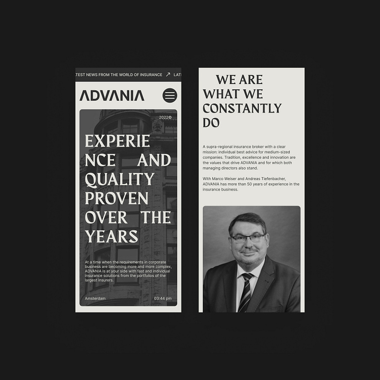
Advania Insurance Company Website Concept Pt.2
In this concept design, tradition meets modernity, reflecting the robust heritage and forward-thinking approach of ADVANIA, an insurance company with a legacy. The monochromatic palette speaks of professionalism, while the use of bold, clean typefaces and striking black-and-white photography conveys clarity and trustworthiness. The design is a sophisticated blend of classic and contemporary elements, mirroring the company's commitment to providing reliable advice and high-quality standards.
If you see something inspiring for your next project, drop me a line at
For more eye candy, follow:
More by Vlad Grechny View profile
Like
