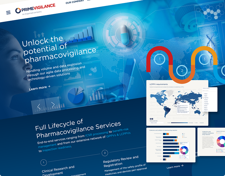
PrimeVigilance Website and Interactive Graphics
Worked collaboratively with the Moriarti Design team and Ergomed Group to enhance the visual layout of the PrimeVigilance website, implementing custom-built interactive tools and graphics to elevate user experience and modernize the platform. Conducted a comprehensive overhaul of the website's content, ensuring accuracy and reflecting the latest developments in the industry.
Website pages
Amidst evolving industry demands and a commitment to excellence, PrimeVigilance embarked on a transformative journey to redefine its online presence. The mission: to revolutionize the user experience and reflect the company's expanded service offerings through a complete overhaul of primevigilance.com.
From reimagining website architecture to integrating cutting-edge interactive tools, every step was meticulously crafted to enhance user engagement and accessibility. your text here...
Recognizing the diverse needs of its users, we approached the redesign with a dual focus on desktop and mobile compatibility. Understanding that accessibility is paramount in an age where browsing habits vary across devices, the design process prioritized responsiveness and fluidity across all screen sizes.
For desktop users, the layout was meticulously crafted to optimize the browsing experience without sacrificing visual impact. Through strategic placement and intuitive navigation, interactive tools are seamlessly integrated into the design, enhancing user engagement without overshadowing the main content. By positioning these tools in prominent yet unobtrusive areas, we ensured that visitors could easily access key functionalities while remaining focused on the site's core offerings.
Similarly, for mobile users, the design underwent rigorous testing and refinement to ensure seamless functionality and intuitive interaction. Recognizing the limitations of smaller screens, PrimeVigilance adopted a mobile-first approach, prioritizing essential content and streamlining navigation to accommodate on-the-go users. Interactive tools were thoughtfully adapted to maintain usability and functionality across various mobile devices, ensuring a cohesive experience regardless of platform.
Navigation
In aligning with contemporary browsing habits and user preferences, we prioritized a mobile-first approach to navigation, ensuring seamless accessibility and intuitive interaction across all devices.A simplified menu structure was adopted, featuring clear and concise categories that allow users to quickly locate relevant information with minimal effort. Dropdown menus were streamlined to prevent clutter and optimize screen real estate, ensuring a seamless browsing experience on smaller screens.Additionally, the navigation system was designed with scalability in mind, allowing for easy expansion as PrimeVigilance's services and offerings evolve over time. Through modular design principles and flexible architecture, the website's navigation can adapt to future changes without disrupting the user experience or requiring extensive redesign.
Interactive tools
Understanding the complexities in navigating diverse regulatory landscapes across different regions, PrimeVigilance sought to empower users with a comprehensive and user-friendly solution. Users can seamlessly navigate the map interface, selecting their desired location to access tailored insights into local pharmacovigilance regulations, requirements, and nuances. From reporting obligations to licensing requirements, the tool provides a comprehensive overview of the regulatory landscape.
Interactive infographics
Facilitating understanding of the company's services extends beyond just textual content with the implementation of interactive diagrams across key service pages. These dynamic visual aids serve as powerful tools for conveying complex concepts and processes in an engaging and accessible manner.


