UI Challenge : Day 8 (SaaS Dashboard for Clarity and Action)
Day 8: Streamlined SaaS Dashboard for Clarity & Action
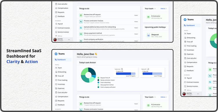
Today's UI Challenge entry tackles the often-cluttered world of SaaS dashboards! This redesign prioritizes clarity and information density, helping users stay on top of their projects.
Key Features:
Visual Hierarchy: Hero section highlights crucial KPIs, while modular cards break down project details.
Data Visualization: Charts and graphs present information concisely.
Actionable: Prominent CTAs drive user engagement.
Customization: Filters and prioritization options for a personalized experience.
What do you think? How can dashboards be improved for better user experience?
#UIChallenge #SaaS #DashboardDesign #DataVisualization #UserExperience
Feel free to follow my work for more design explorations:
Looking forward to connecting!

