Manettas
UI Elements
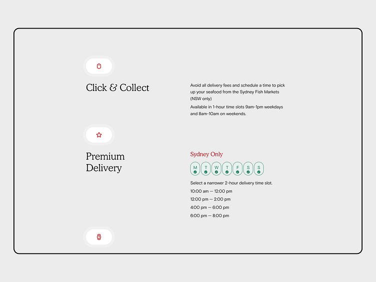
To complement the rest of the visual identity with round corners in mind, we expanded the same approach to the iconography that it’s used across the brand.
Full Case Study on Behance 🤘 https://www.behance.net/gallery/181920525/Manettas
More by Lorenzo 🤘 Bocchi View profile
Like
