Best of the Boroughs Concept 1

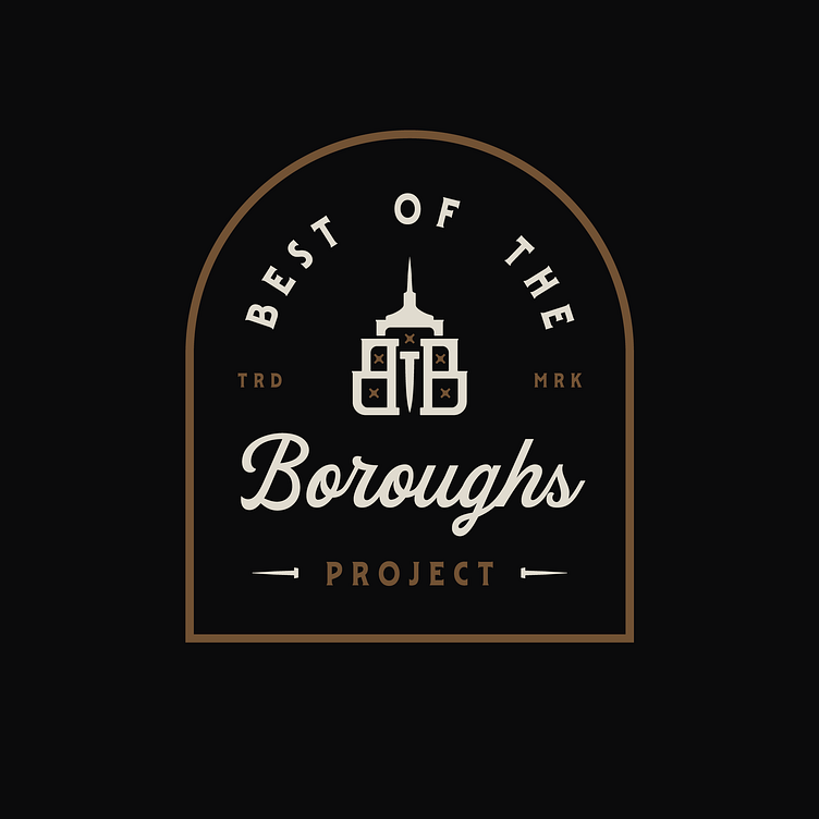
This logo features the silhouette of The Empire State Building and two B's. If you look closely, you'll see an O and T for "of the". But that's a hidden little nugget. The T doubles as a nail to represent something NYC is famous for; the construction of many massive buildings. The five X's represent each of the five Boroughs of New York City. X's were used as a reference to The Flag of Amsterdam - as New York City was originally named New Amsterdam when it was settled by the Dutch in the 17th century.
Heading
Best of the Boroughs Project Logo Concept 1
Enter your text here...