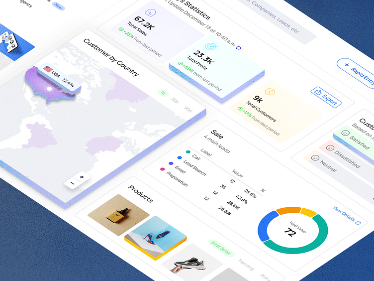
NexSpark CRM Dashboard UI Design
The CRM dashboard design presented in the image provides a comprehensive and user-friendly interface that appears to solve several user experience problems commonly encountered with complex data systems. Here's a breakdown of how the design addresses these issues:
Clarity and Legibility: The use of large, bold fonts for the main figures ensures that the most important information stands out immediately to the user. The choice of colors and typography enhances readability and directs the user's attention effectively.
Data Visualization: Key statistics are represented not just in numerical form but also visually through progress bars and pie charts. This allows for a quick assessment of the data without the need to process raw numbers.
Navigation: A clear and consistent navigation menu on the left-hand side provides easy access to various sections of the CRM, such as Dashboard, Leads, Customers, and Sales. This organization helps users quickly find the features they need.
Information Hierarchy: The dashboard is divided into sections with distinct headings, like "Today's Statistics," "Customer Satisfaction," "Customer by Country," "Sale," and "Products." This compartmentalization makes it easier for users to digest information in chunks.
Real-Time Data Updates: Indication of the last update timestamp gives users confidence that they are viewing the most recent data.
Customer Insights: The "Customer Satisfaction" section quickly conveys the sentiment of the customer base, a critical metric for businesses. Additionally, the "Customer by Country" map allows for a geographical visualization of market penetration.
Actionable Insights: The "Sale" section with its " Adjustable main leads" and respective percentages shows a breakdown of sales channels, helping users to quickly identify which areas are performing well.
Product Focus: The "Products" section is neatly divided into 'Best Seller,' 'Trending,' and 'Risky' categories, which can guide users in inventory and sales strategy decisions.
Engagement: The "NexPro" advertisement for upgrading encourages users to engage more deeply with the CRM's features, suggesting a clear path for user progression.
Responsive Design: The layout is grid-based, which likely means it can adapt well to various screen sizes, an essential feature for users who may access the CRM from different devices.
Consistent Color Scheme: The color palette is consistent and subtle, with a balance of warm and cool tones that delineate different sections without overwhelming the user.
Overall, this CRM dashboard design emphasizes on accessibility, actionable insights, and efficient navigation, all of which contribute to a positive user experience.


