VerbeterBazen
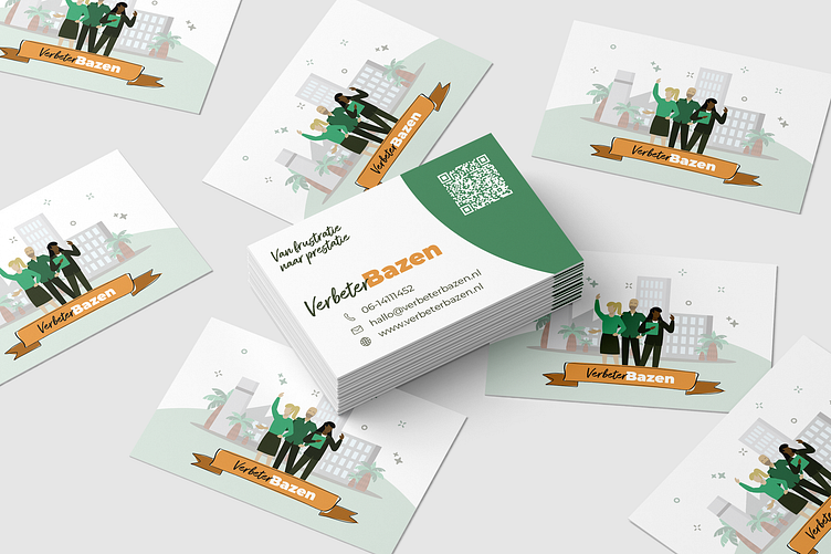
For this project, we've created illustrations that align with the branding of VerbeterBas. Verbeterbazen serves as an extension of the VerbeterBas organization, aimed at supporting the narrative of the improvement bosses. We've also designed the logo, branding, and website to complement this vision.
We opted to create a vector illustration, with the buildings symbolizing the corporate world. VerbeterBas focuses on implementing the LEAN methodology within companies. By extending the style of VerbeterBas and adding a different color to Verbeterbazen, it has its own identity while still clearly being part of the same organization.
During the design process, we took into consideration the owner's identity, the target audience, and the industry. The branding has ultimately become a blend of color, cheerful yet professional. Each brand within the family utilizes distinct colors from the original brand guidelines, maintaining cohesion while allowing for individuality and differentiation.
Webdesign
Last but not least, the web design was realized using Framer, a Dutch tool that is increasingly gaining popularity. Framer is a visual builder, making it easy to create websites from a creative (rather than technical) perspective. The integrations with Figma are also highly interesting; by setting up Figma properly, you can build a website much more quickly. Take a look! Visit www.verbeterbas.nl.

