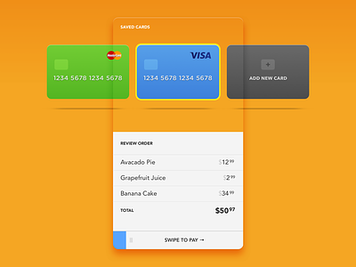
Daily UI 002: Credit Card Checkout
Slight throwback from my #dailyui shot from a few days ago. The prompt for day two was "Credit Card Checkout."
I spent lots of time thinking of checkout concepts and flows with credit cards involved, but then I felt that #dailyui really lets me focus on UI elements individually.
This concept lets the user browse through saved cards, or add a new one. The user can also review the order and make changes (remove items by swiping).
Finally, to confirm payment, the user swipes right — an inspiration from literally swiping cards to make payments.
Would love to hear your thoughts on this! :)
More by Abhas Sinha View profile
Like
